Viva Magenta (18-1750) is called 2023 Pantone’s Color of the Year. Described by the brand as "an unconventional red for an unconventional time", Pantone's vibrant pinky color with hints of purple belongs to the red color family. It's a vibrating and energetic color. It is a shade rooted in nature descending from the red family and expressive of a new signal of strength according to Pantone. Viva Magenta is brave and fearless, cheering for celebration and positivity.
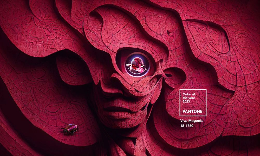
Pantone Color of the Year 2023 Viva Magenta
Pantone's Color of the Year 2023 Viva Magenta is powerful and empowering. It is a new animated red that revels in pure joy, encouraging experimentation and self-expression without restraint. An electrifying, boundaryless shade that manifests as a stand-out statement. Pantone 18-1750 Viva Magenta welcomes anyone and everyone with the same verve for life and rebellious spirit. It is a color that is audacious, full of wit, and inclusive of all.
Leatrice Eiseman (Executive Director, Pantone Color Institute):
"In this age of technology, we look to draw inspiration from nature and what is real. Pantone 18-1750 Viva Magenta descends from the red family and is inspired by the red of cochineal, one of the most precious dyes belonging to the natural dye family as well as one of the strongest and brightest the world has known.
Rooted in the primordial, Viva Magenta reconnects us to the original matter. Invoking the forces of nature, Pantone 18-1750 Viva Magenta galvanizes our spirit, helping us to build our inner strength."
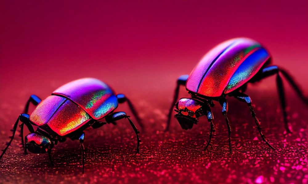
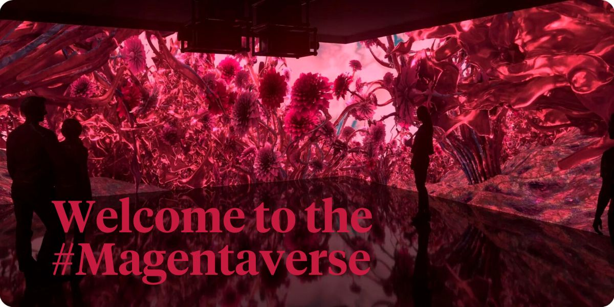
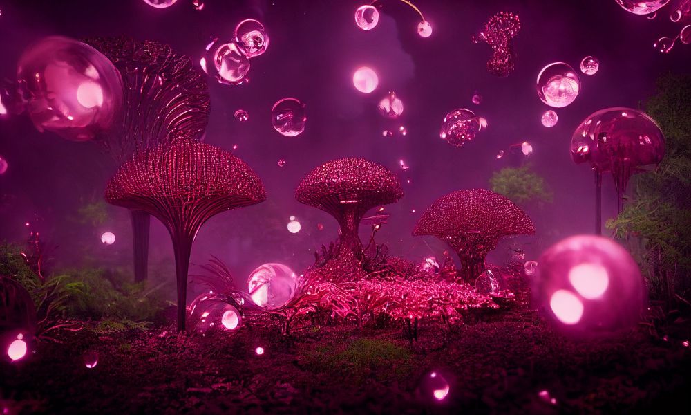
Welcome To the #Magentaverse
Pantone’s process for selecting the color it thinks syncs most with the spirit of the moment combines methodological research and gut instinct. During a presentation for Vogue, the brand pointed to a plethora of spontaneously generated magenta sightings sourced from fashion, cosmetics, concept car design, digital art, social media, and even the highlights in magician Criss Angel’s hairstyle. This exercise in color-coded anthropology convinced them of Viva Magenta’s contemporary cultural currency. They then asked themselves why the carmine red—whose dye was originally sourced from the cacti-consuming cochineal—was the subject of such broad consensus now.
Pantone's conclusion?
"We are looking at a color that highlights the change of perspective, that spotlights the need to feel empowered, and that is infusing us with strength that we can courageously and positively and fearlessly embrace a new pathway with confidence.”
