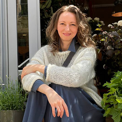
If there is one thing that will always draw our attention, it's color. Where bright and flashy colors will be noted first, the more modest pastel colors equally deserve our attention. Not everything needs to be shouted out. Subtleness works better on many occasions. Like with this Chrysanthemum Pastel Rosé that I found and used in a design that to me reflects an autumn sunrise in Paris.
Color Draws Our Attention
It's no secret that color is the first thing our eyes see. A brightly dressed person is hard not to notice. But often the radiant color of the clothes is the only thing we remember about them after the meeting. Color draws a lot of our attention, leaving no possibility to think about personality.
At first, we notice the most vivid color in the interior, and only after that do shapes, textures, and details catch our glance.

Nude & Pastel Palettes
These days we can see nude and pastel color palettes in the collections of fashion houses more and more frequently. On the catwalk, pastel shades emphasize femininity, lightness, and subtleness. Now it's more common that neutral colors are used by designers to decorate expensive interiors, showing the cleanliness and coziness of the house.
Pastel shades are not flashy. They are not immediately looked at. That is why such shades complement any work with a more profound meaning. Pastel colors, as well as black, are becoming a sign of high-end aesthetics. Working with pale-colored flowers feels like looking into their souls, without our attention being distracted by anything else.
Impressionists loved pastel shades. Do you remember the series of paintings by Claude Monet 'Haystacks' and 'Rouen Cathedral'? We can see how the choice of colors is changing in paintings depending on the time of the day when the artist was painting them.

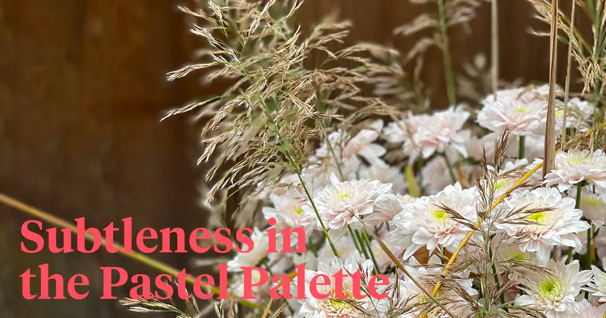
Chrysanthemum Pastela Rosé
I made that remark about the paintings because Chrysanthemum Pastela Rosé is one of a kind: in a vase, this chrysanthemum changes its color from the most delicate pink to white. It seems to be living while fading away.
In addition, the delicate pink color of Pastela Rosé is similar to pink pearls - the rarest type of pearls. And the goal of the florist is to choose a design that will further emphasize the beauty and dignity of this flower sort.


My Design - Autumn Sunrise in Paris
I always feel sorry for cutting the stem length, so when it is possible to use it to the maximum, I do it. A lot of effort and soul of the gardener has been put into each flower, and that's why I want to show its beauty, nobility, and majesty wholly.
In my work, the Pastela Rosé chrysants complemented by dry leaves and herbs look like an 'Autumn Sunrise in Paris'. The dark gray colored plant pots are like the roofs of Parisian buildings. Or maybe the flowers of Pastela Rosé remind us of the blush on the cheeks from gentle kisses?


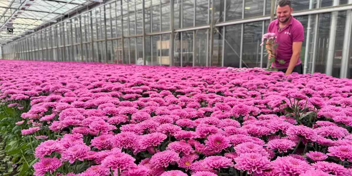
This Chrysanthemum Pastela Rosé is from breeder Dümmen Orange and grown by Zentoo.