Go Mad for Scorched Earth
I wonder what it is that makes us go mad for Scorched Earth? This is possibly because it gives a wonderful warm aura in the summer, reflective and reminiscent of sunny days. Whilst remaining perfectly cozy and comforting in the cool winter months. 
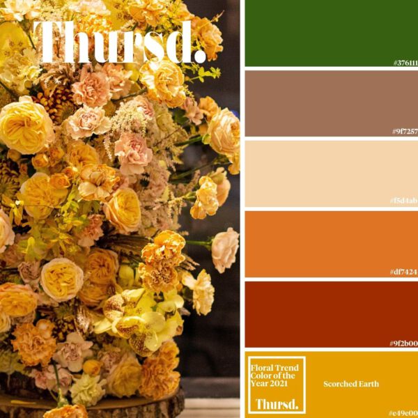
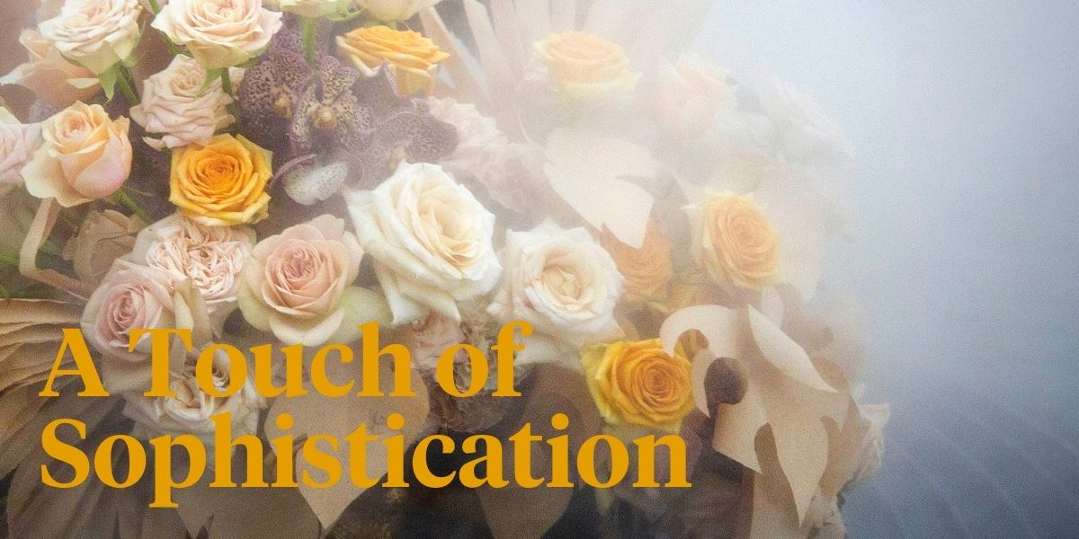
Scorched Earth as the name suggests is bright, perfect for those who appreciate color, yet has a touch of sophistication by the delightful dose of respectable yellow-brown. A dark yellow, that is softer on the eye than vivid yellow. If scorched earth is your favorite color it may suggest you have a desire for creativity and uniqueness.
The Comeback Color
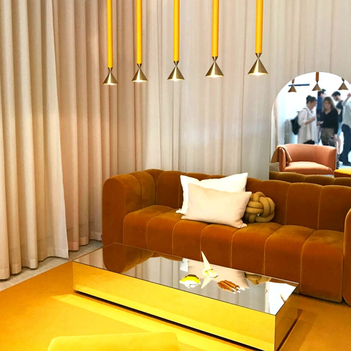
Scorched Earth is the Comeback Color of the Year 2021. This spicy shade of yellow is everywhere next season. Here's how to decorate with the sunny color both indoors and out. Somewhere on the color wheel between yellow and orange lives the perfect sunset shade. Dubbed marigold or mustard with a tone of brown by design pros and paint experts, this warm color conjures up memories of groovy '70s interiors. But the sunny shade is trending once again, and this time it's anything but retro. 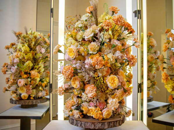
Trendy, But Not Glamorous
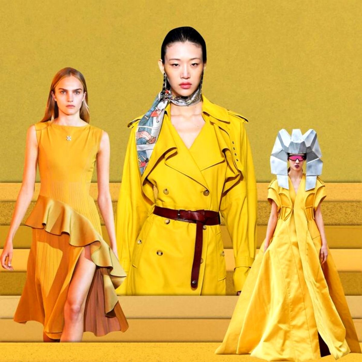
When one thinks of glamorous colors, Scorched Earth rarely comes to mind. It’s trendy, maybe, but not glamorous. So, let me say that positively one of the color trends emerging from Paris Fashion Week was closest to a French’s yellow, or maybe a grainy Dijon, as seen at Rick Owens, Margiela, Off-White, and more. Designers have recently enjoyed using either rainbow bright colors, or exclusively muted neutrals. Beige, anyone? Scorched Earth is different: it’s bold, but also muddy. It’s not neutral, but it does offset other shades surprisingly well.
Go For Gold or Contrasting Tones
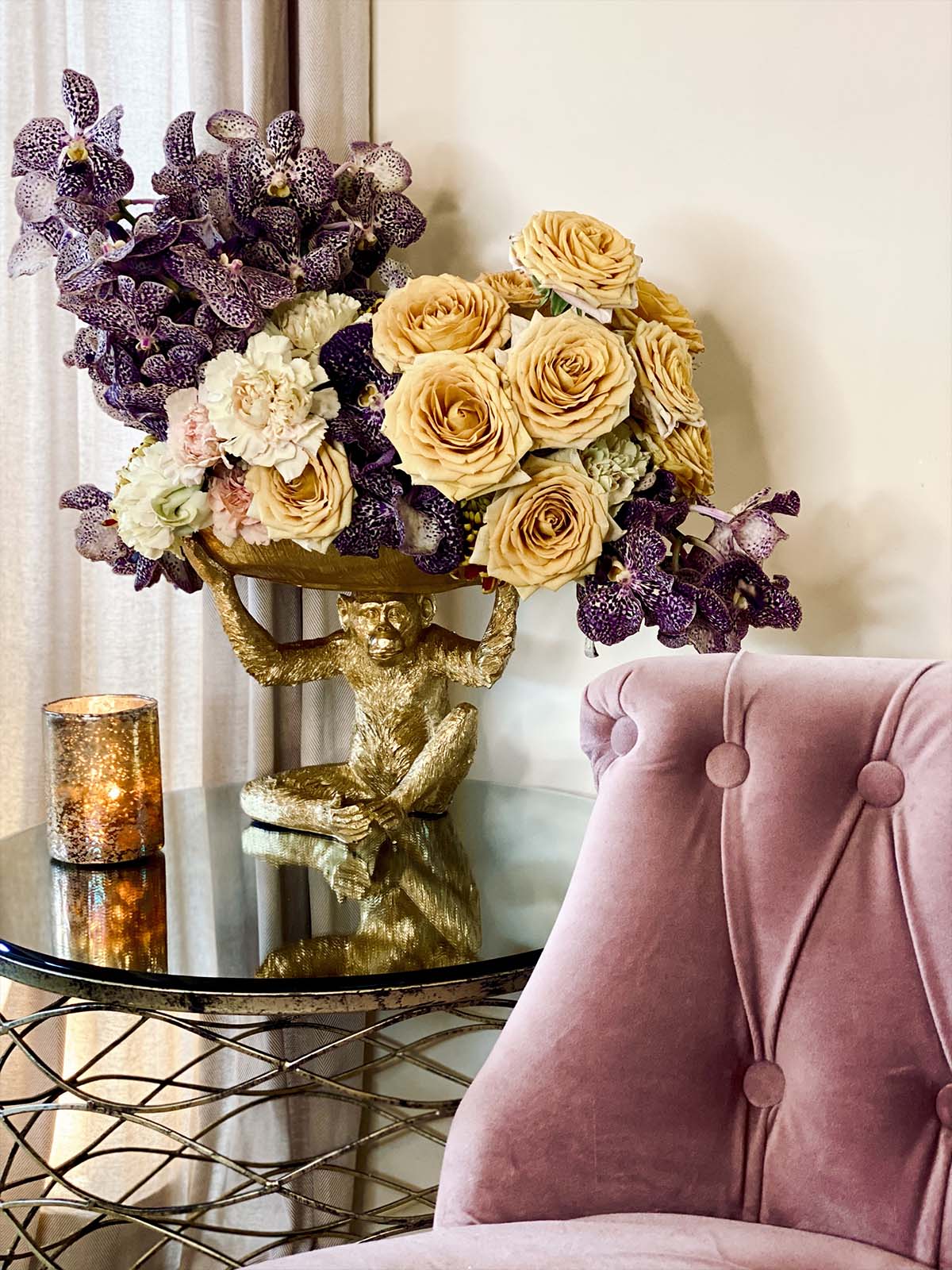
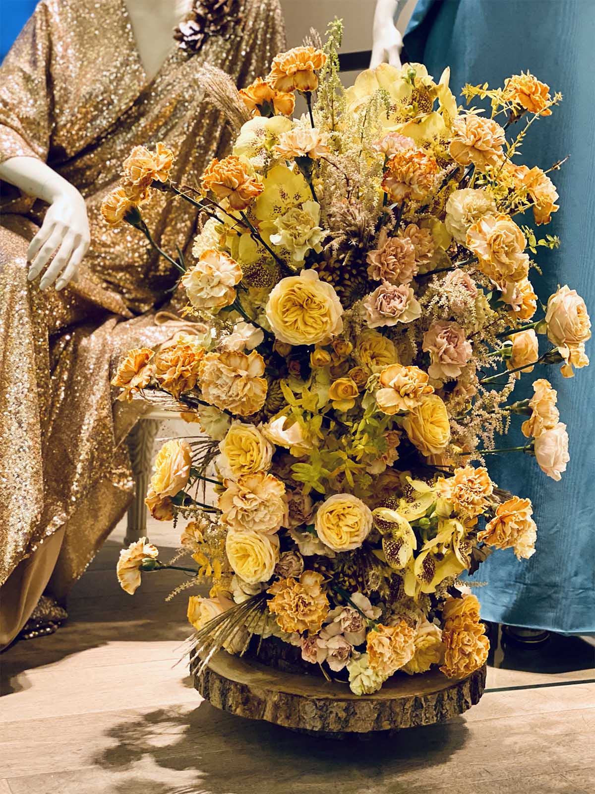
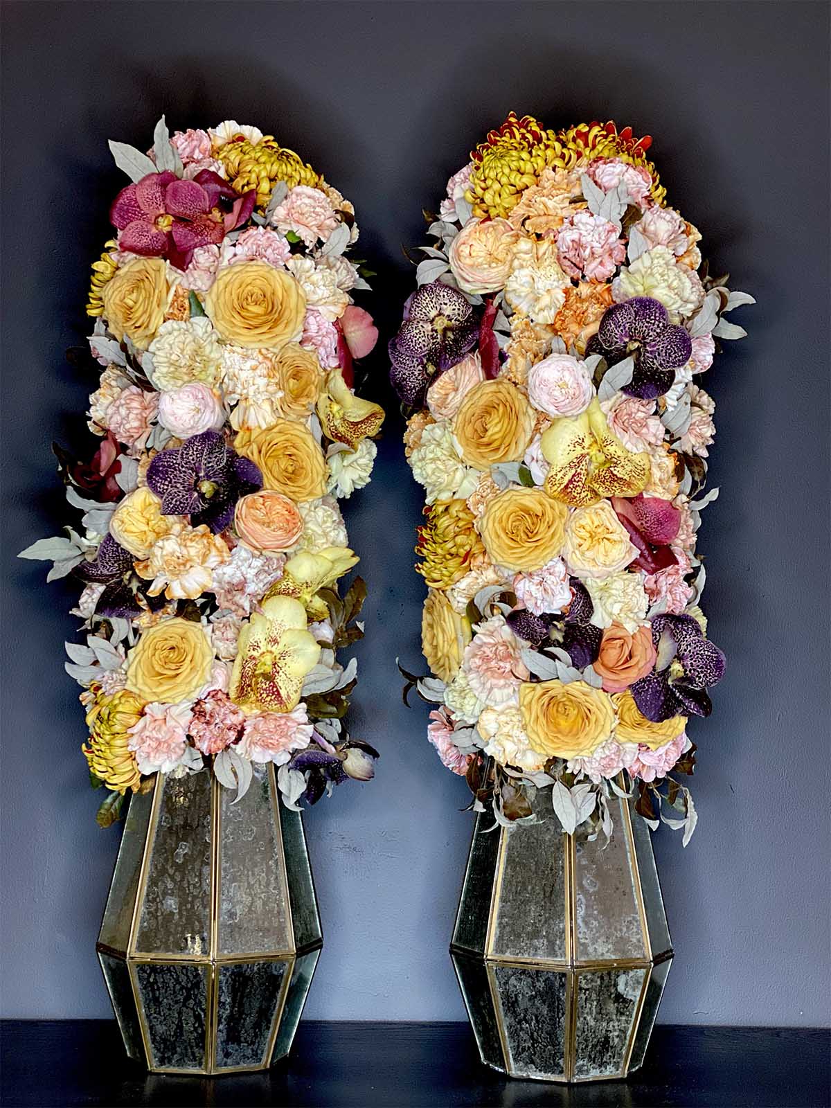
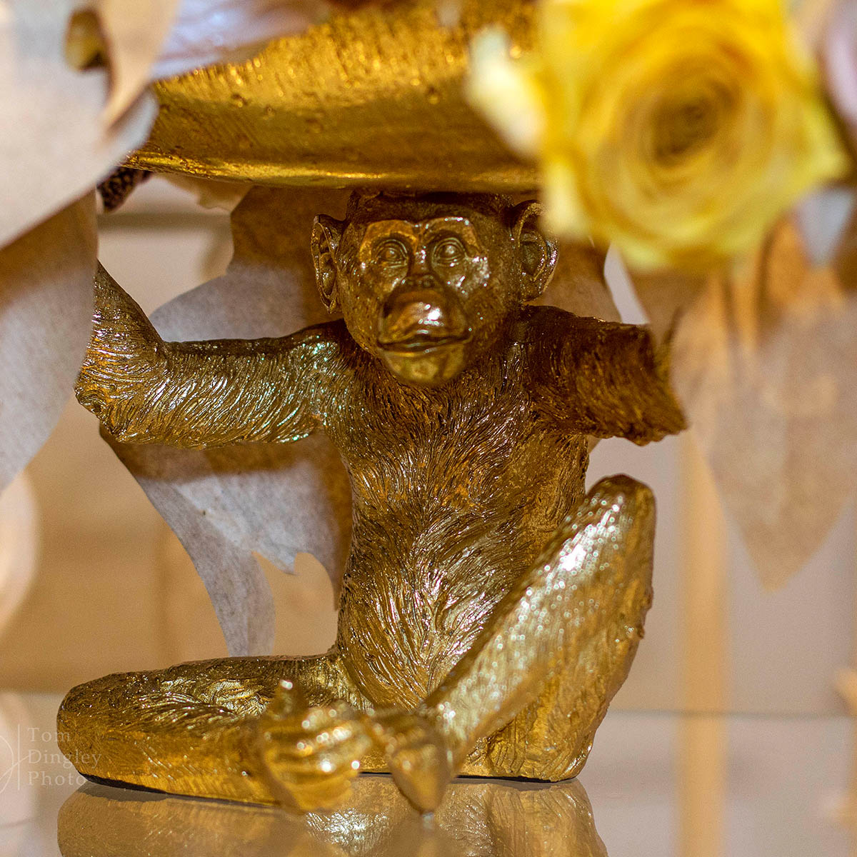
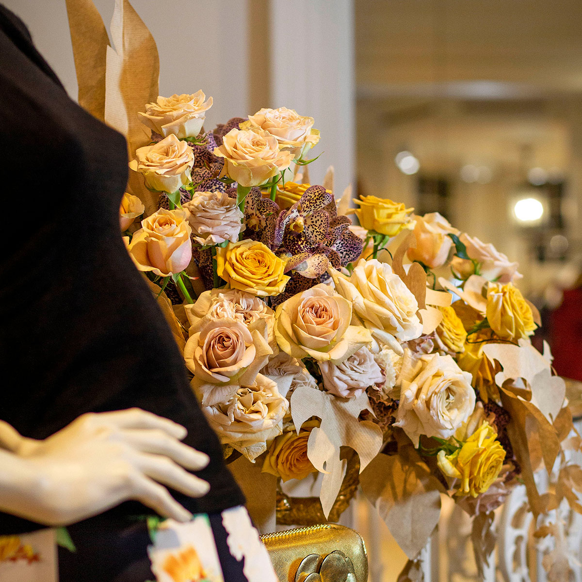
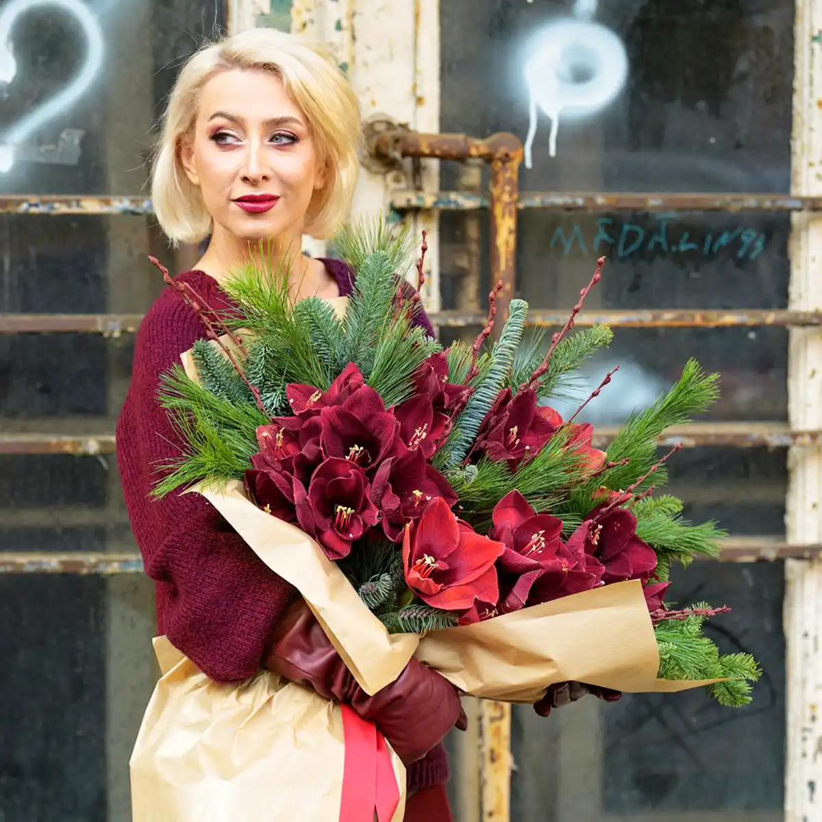
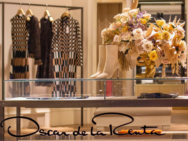
Scorched Earth goes pretty well with gold tones or in strong contrast with dark or vibrant colors. Depending on how you combine this color, it either can become elegant and chic or in combination with natural materials like wood, it becomes more natural and rustic. A big topic in window displays of high fashion brands will be leaves and other organic forms, cut and interprets of paper. There is a big trend for recyclable and reusable materials. Raw paper is becoming a big topic. Customers are demanding more eco-friendly materials rather than wrapping bouquets and present up into cellophane. So why not playing with this idea and bring the paper into the design? 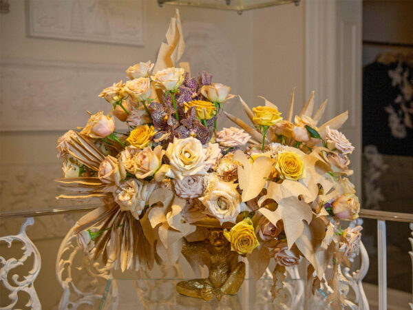
Growers with Scorched Earth
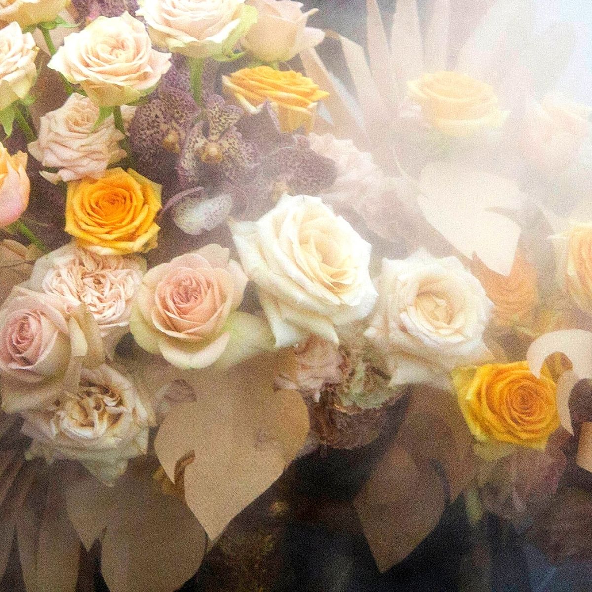
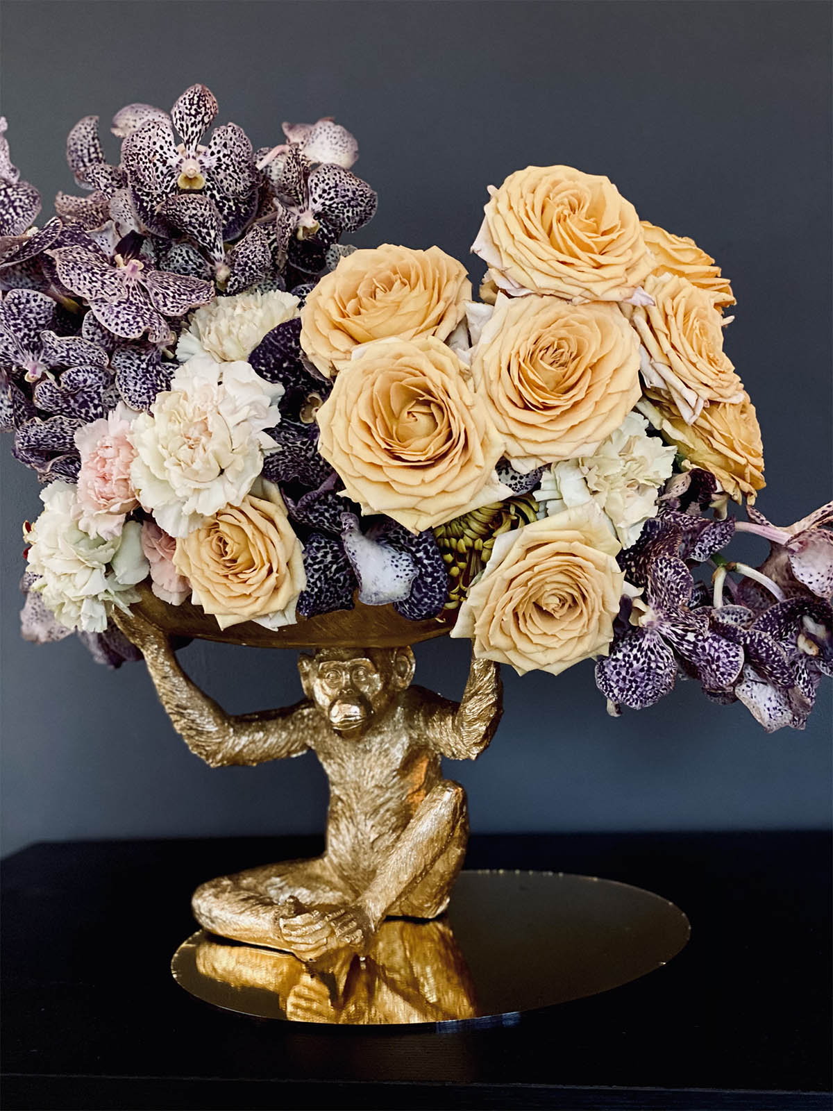
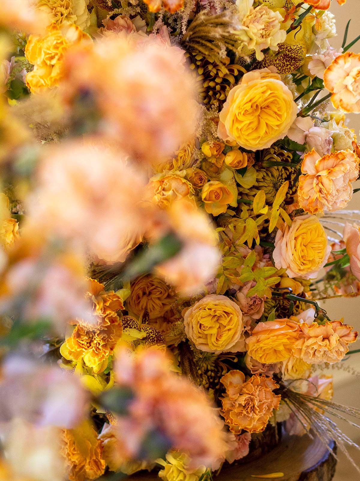
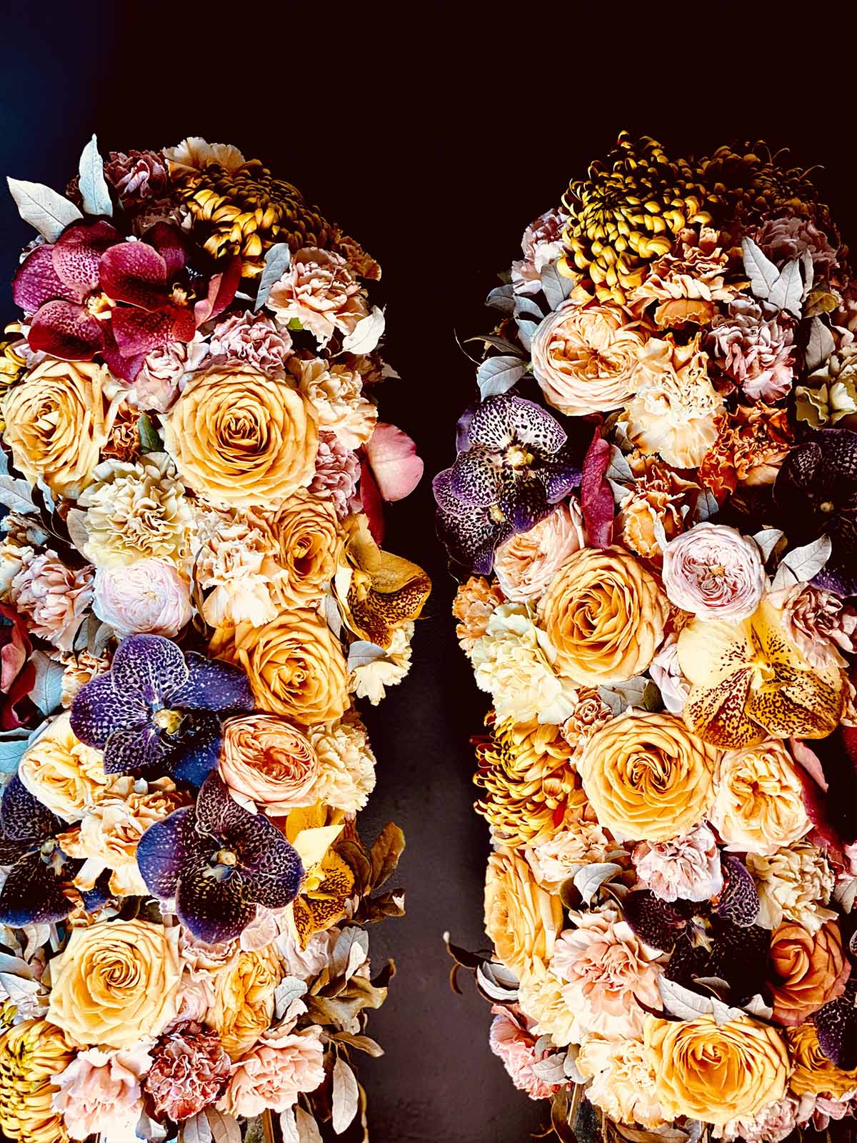
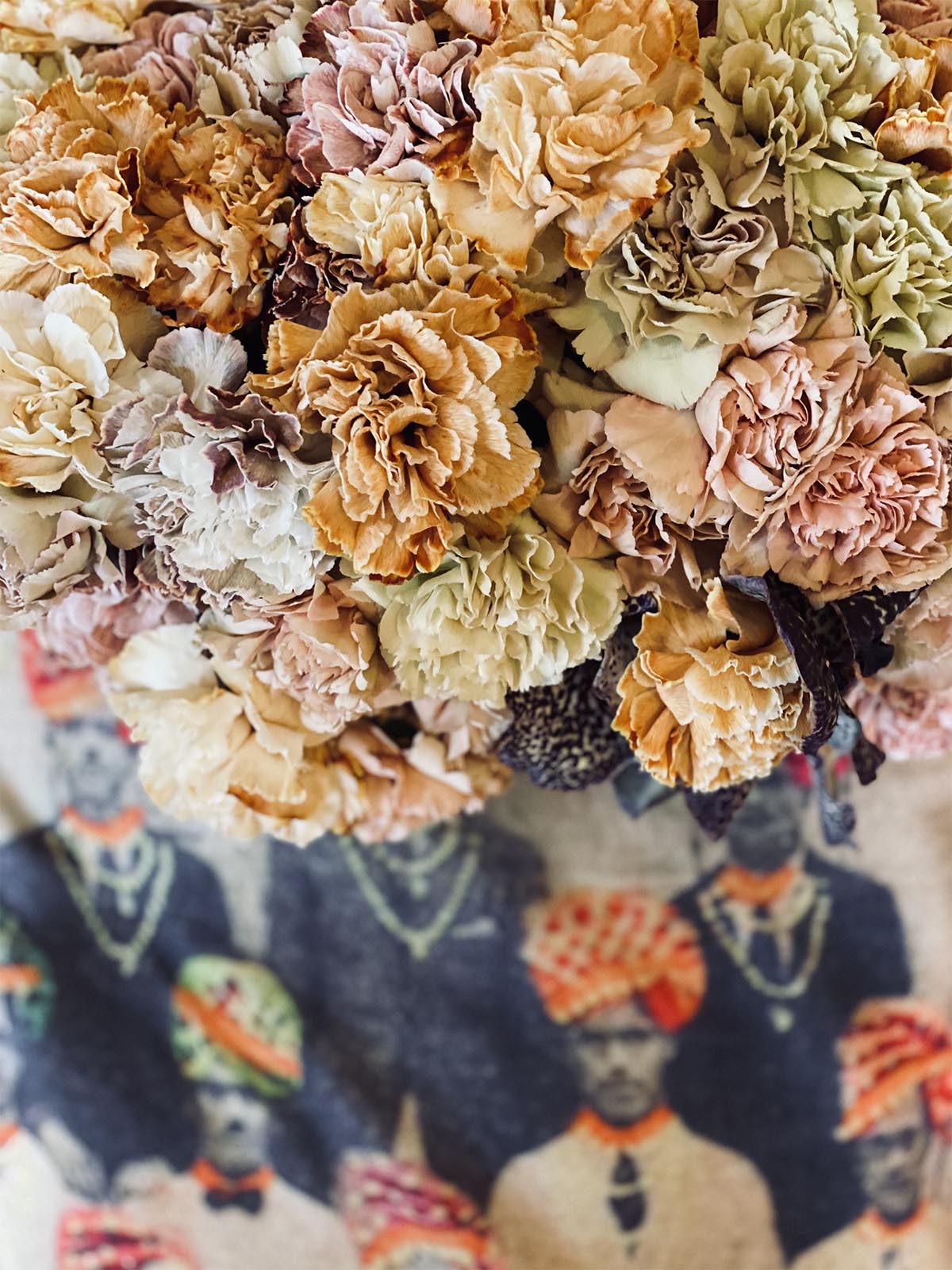
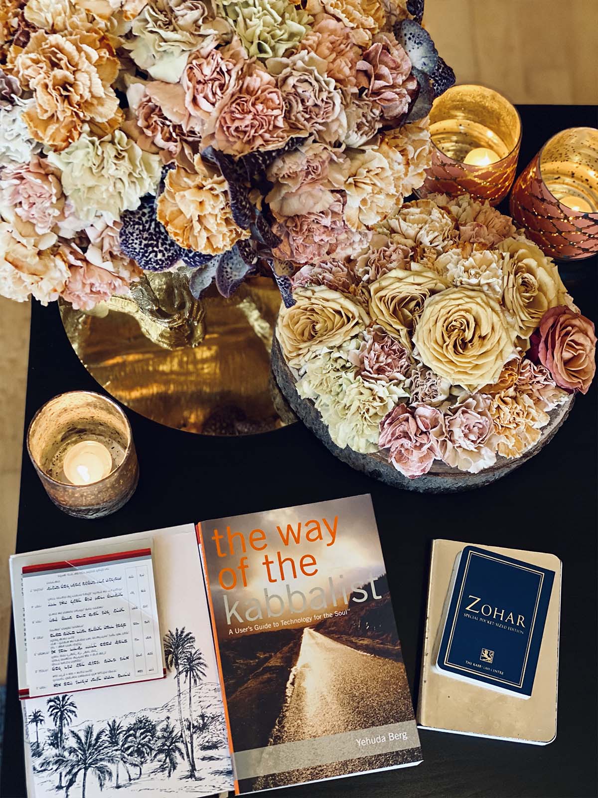
Our growers are fully into the trend of Scorched Earth. They are providing a huge variety of new colors and tones. Dyed flowers were already a big trend last year and are becoming even bigger in 2021. With these new techniques of coloring flowers, we designers can play with colors much softer and work out all the different hues of colors. Also, many contrasts are becoming now much more interesting with these beauties. Like these perfectly matching Carnations from VIP Roses.
Photo credits: Timo Bolte, Tom Dingley Photography Flowers by: Ansu Vanda, VIP Roses 