Christmasworld Trends 26+ reads like a walk through an enchanted forest. Not the sugar-sweet kind, but the one where light slips through branches, textures feel a bit mysterious, and the 'old stories' get re-written with modern hands. No wonder, because the overall theme is 'Modern Fairytales'.
The Trend Area in Frankfurt was built around three trend worlds by Stilbüro bora.herke.palmisano, and they sit under one clear umbrella: responsibility, nature-connection, and future optimism.
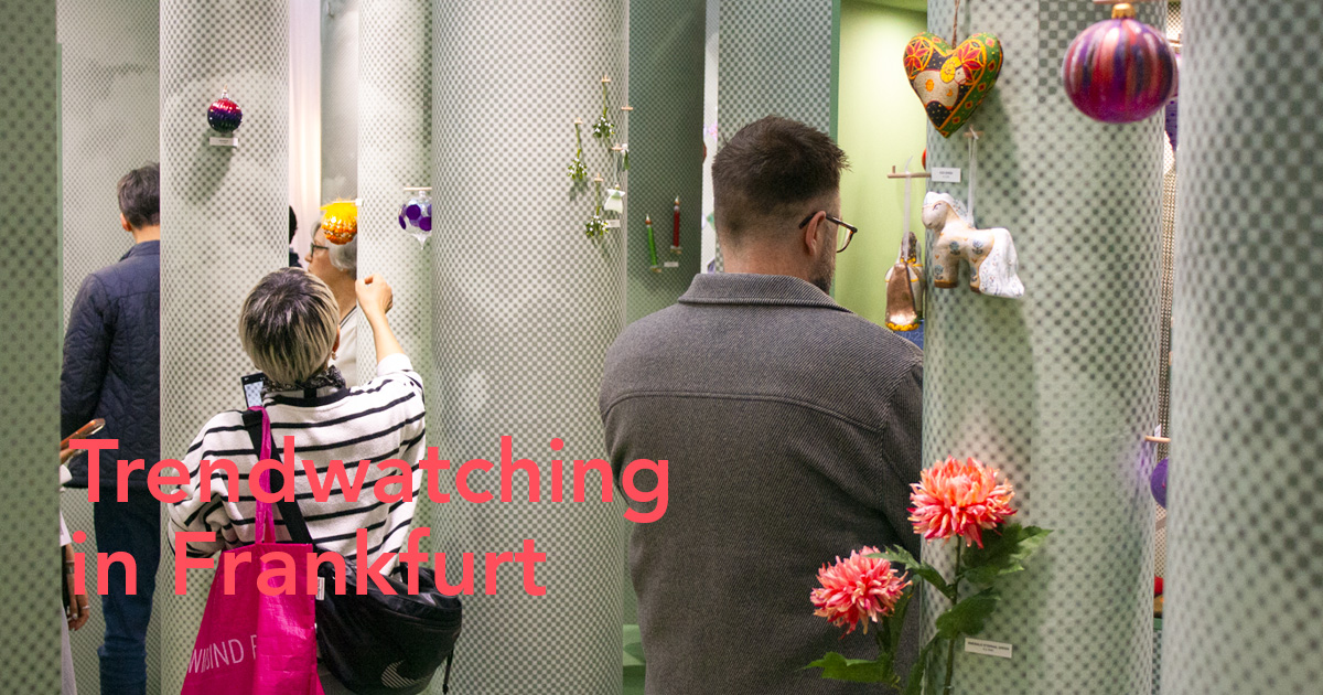
Trends 26+ at Christmasworld 2026
Stilbüro bora.herke.palmisano researches the coming trends and has been on the move for Messe Frankfurt wherever trend-setting materials, techniques, and products are created. One of their key priorities was to identify sustainable solutions that make our lives more environmentally friendly and future-oriented. Through their analyses, lectures, and inspiring special shows, they consistently provide valuable guidance to wholesale and florists.
For florists, the overall theme 'Modern Fairytales' is a helpful framing. It means you can lean into narrative design, expressive materials, and recognizable motifs, while still keeping it contemporary and sellable. Think: a bouquet that feels like a scene, a window that feels like a chapter, a tablescape that hints at a story without turning into a costume.


Below are the three trend worlds that were presented during Christmasworld 2026 and what they mean for your floral work, styling, and seasonal setups.
1. Brave: Narrative Beauty With Copper, Pixel Motifs, and Retro Tension
The 'brave' world starts with a simple question: what moves us? Unexpected impulses, narrative beauty, figurative motifs, and those comforting echoes of the past. It's about letting attraction and usefulness overlap, so the 'wow' factor also works in real interiors and retail.
Materials and surfaces here are all about mix-and-match. Craft techniques meet digital technologies, and the outcome should look a little unconventional and artistic. You'll see hand-painted patterns that are digitally edited, textured surfaces, graphic pixel motifs, and copper showing up like a lead actor in the cast.
Color Cues
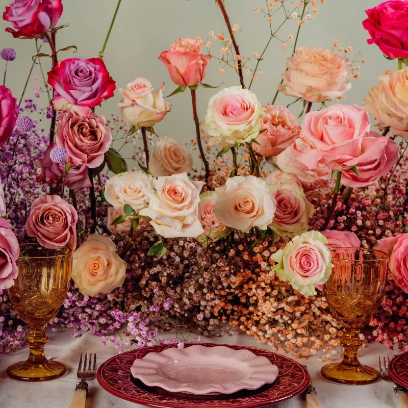
The palette leans bold and spirited: strong colors next to gentle hues and darker tones, with copper in many shades bridging to expressive reds and violets.

Credits for the pieces in this image:
1. Bow Chair by Worn Studio
2. retro-inspired stripes
3. hand-painted, digitally edited patterns
4. Copper
5. textured surfaces
6. Nut Family Urushi Edition by Kai Linke, Photo: Ingmar Kurth
7. Botanical Candle, Green Hellebore by Lola Lely + Yesenia Thibault-Picazo for WAX Atelier
8. graphic pixel motifs
Floral Translation
- Go for contrast that still feels composed: glossy copper wire alongside matte ribbons, velvet-like wraps next to crisp printed paper.
- Use figurative elements sparingly. One stylized bow, one graphic bauble, one pixel-like pattern panel. Let the flowers do the talking.
- Flower choices that match the 'bold-meets-soft' tension: Anthurium, Celosia, Dahlia, and Cymbidium orchids against airy ingredients like Gypsophila, Clematis vine, or soft grasses.
- Copper is your bridge material. Copper mesh, copper-toned pin frogs, copper spray accents on pods, or a copper vessel that grounds a wild color palette.

2. Light: Moonlit Pastels, Frosted Effects, and Circular Thinking
'Light' is the trend world that turns winter into an indoor refuge. Cozy, warm, flooded with light, and open to memories and future wishes. The key design note is that intuition leads, and materials matter: environmentally friendly choices and circular thinking are explicitly part of the story.
The focus is on ultralight material effects: shimmering surfaces, graceful sheen, and airy transparency. It's a subtle play with perception, amplified by misty color transitions.
Color Cues
The colors are moonlit and atmospheric: matte silver, cloudy pastels, and then a controlled addition of darker, earth-inspired shades that feel 'mysterious and protective'.

Credits for the pieces in this image:
1. Frosted Mirror Syriacus by Christian Pellizzari for Nilufar at NOMAD St. Moritz 2025, Photo: Filippo Pincolini
2. Luminora Light by Cristina Celestino for Moooi
3+4. Christmas baubles by Inge Glas Manufaktur, Photo: Rudi Gick GmbH, Michelau
5. frozen effects, icy transparency
6. Odd Candle Holder by Normann Copenhagen
7. relief and reflective surfaces
8. Christmas Paper Tassels by Amanda Betz for FERM LIVING
9. Liquid Vase by Dorian Renard, Photo: Dorian Renard
Floral Translation
- Make 'air' visible. Use transparent or frosted vessels, acrylic plinths, and lightweight armatures that lift stems into space rather than bundling everything tight.
- Build with tonal fades: start in pale lilac or misty blue and slide into deeper forest tones in one composition.
- Silver can be matte, not mirror. Think brushed metal containers, frosted picks, soft metallic papers.
- Winter product that fits: Helleborus (especially in pale green or creamy tones), Anemone, Ranunculus, Tulipas, and delicate branches. Add texture with lichens, airy grasses, and translucent ribbon.
- If you do installations, this is a strong window language: layered sheers, paper tassels, and ‘frozen’ textures framing a calm centerpiece.
Source: @christmasworld.frankfurt.
3. Solid: Minimalism Meets Poetry, With Geometry and Longevity
'Solid' is the trend world for anyone who wants clean lines without going cold. The message is that minimalism and poetry are surprisingly good partners. This trend leans on classics, retro citations, geometry, modular thinking, and product durability with lower environmental impact.
Materials here include mirrored metallic surfaces, stylized geometry, precise linear patterns, and honest material hues like wood, metal, and glass.
Color Cues
The palette is neutral and cool, with white as a clean baseline, plus pure cool tones. Then you bring in vivid saturations, but in a controlled way, alternating with steel or aluminum notes. The effect should feel unusual and unexpected, not loud.

Credits for the pieces in this image:
1. Christmas tree by Kay Bojesen Denmark
2. compact, solid glass thickness
3. precise, linear patterns
4. fine wood
5. graphic structures and matte, metallic surface finishes
6. Triangles by Carta Pura
7. Rustic Candles by Broste Copenhagen, Photo: Mikkel Tjellesen
8. Mirror surfaces and metallic high gloss
9. Martini Shot Glass by Traga
Floral Translation
- Think structure-first. Clear grids, repeating modules, and intentional negative space.
- Use fewer varieties, but better quality and stronger form. One statement bloom type, one line ingredient, one grounding texture.
- Great fits: Calla, Phalaenopsis orchids, Anthurium, Protea, Craspedia, and strong branches like Corylus. Pair with clean foliage like Aspidistra or Eucalyptus, used architecturally.
- Containers matter here: thick glass, steel cylinders, simple ceramic blocks, and wood bases. Keep mechanics invisible or beautifully engineered.

A Practical Takeaway for Florists
The Modern Fairytales thread running through all three worlds is a story, but not a theater. You're not decorating a stage. You're giving customers a way to bring a mood home.
If you want a quick rule:
- Choose Brave when you want expressive retail energy and strong gifting stories.
- Choose Light when you want winter calm, premium softness, and airy installations.
- Choose Solid when you want modern classics, clean merchandising, and longevity.
Or mix them the way the trends suggest: a ‘solid’ base, a ‘light’ atmosphere, and one ‘brave’ detail that makes people stop.
Header and feature image by Thursd.