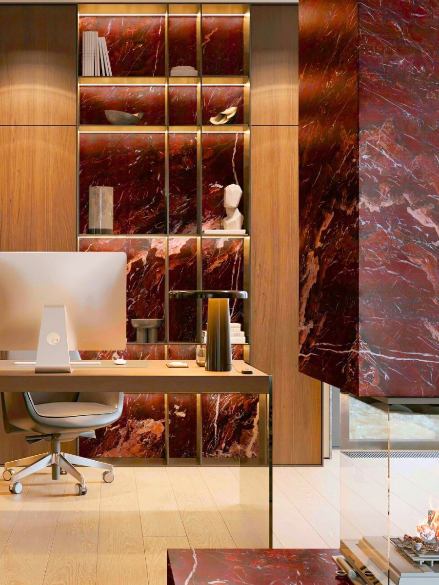
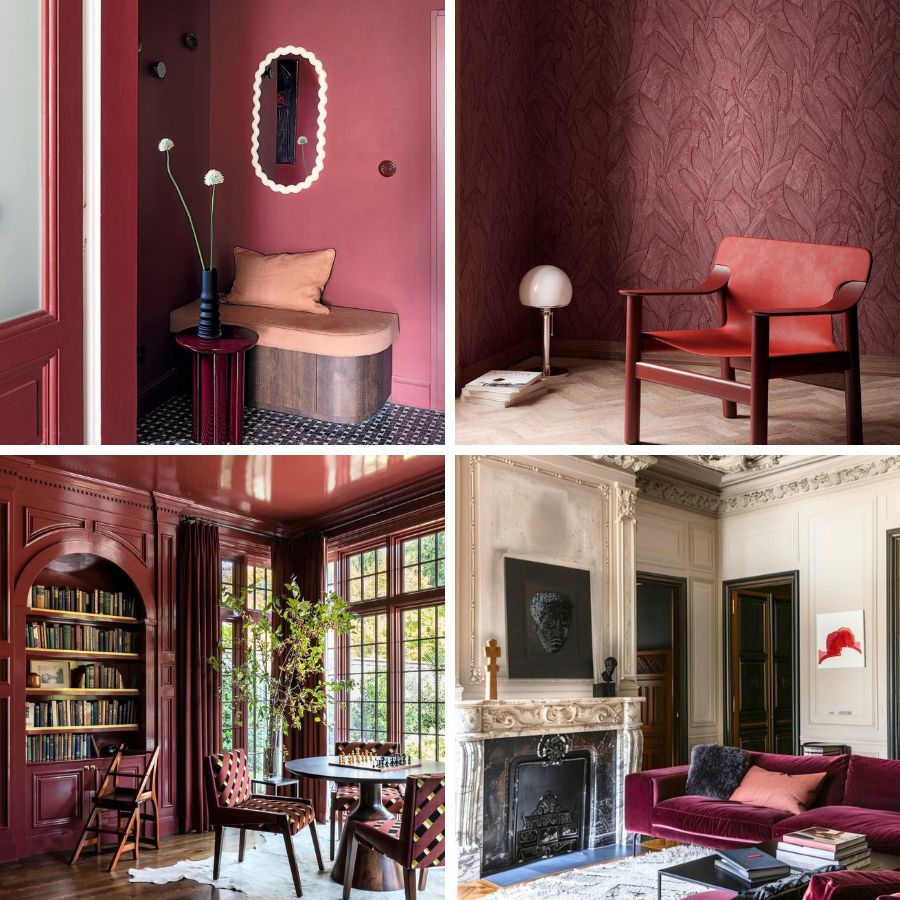
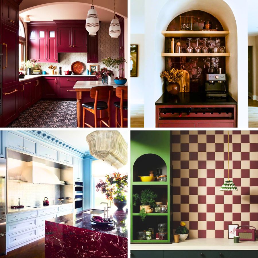
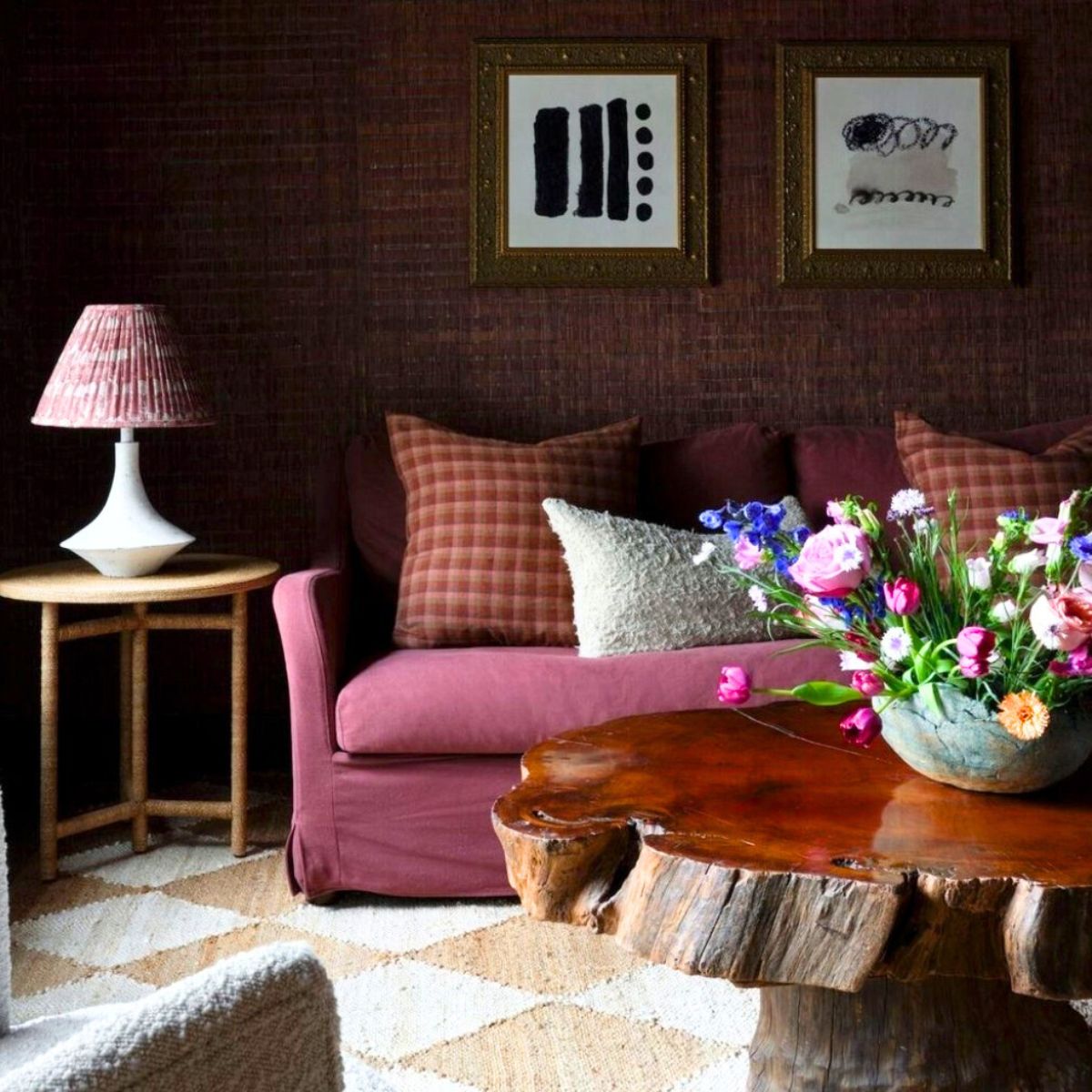
Crimson Nocturne, the Floral Trend Color 2026, reads like a modern classic: deep, warm, and slightly mysterious, it gives spaces presence while overpowering more neutral areas, for example. Used thoughtfully, it can create intimacy in living rooms, drama in dining areas, and jewel-like luxury in bathrooms – yet it also calms and grounds when balanced with the right neutrals and tactile materials. Trend forecasters are already naming richer reds among the next wave of interior colors, and curated crimson palettes show how the tone moves easily from soft blush accents to near-black mahogany depths.
Crimson Nocturne – Why It Works in Interiors
This divine color has emotional and spatial impact in interiors. Crimson Nocturne reads as both warmth and gravity. It shortens perceived distance in a room (making large spaces feel cozier), deepens contrast (so art and textures pop), and signals intent — a red room feels designed on purpose. Because this color sits between the personal (rose, blush notes) and the theatrical (burgundy, wine notes), it suits spaces that want to feel both lived-in and curated.

The color can read romantic and human in daylight, recalling flushed cheeks or candlelight, yet in dimmer settings, it turns cinematic, echoing velvet curtains or aged wine. That makes it a color that works equally well in intimate living rooms, dining spaces meant for long conversations, or even quiet bedrooms that need a dose of passion and strong color.

Used strategically, it amplifies contrast and brings art, textures, and natural materials to life – pale wood, brass, linen, and even concrete take on new dimensions beside it. A wall in Crimson Nocturne doesn’t fade into the background. It has the ability to communicate to anyone entering the space that the color was chosen with thought and emotion – not by accident.

Photo: @sahomeowner
Practical Approaches on How to Use Crimson Nocturne in Interior Spaces
Crimson Nocturne can shift a room’s entire mood with just a touch. The secret is knowing how much to use and where – it’s a color that thrives on contrast, texture, and light.
- Accent walls and alcoves: Paint a single wall or the back of a bookcase to frame artwork or seating and avoid overwhelming the room.
- Color drenching (commitment): For strong, immersive rooms, carry the tone across walls, ceiling, and joinery – it creates a theatrical, cohesive atmosphere.
- Soft furnishings: Velvet sofas, linen curtains, or throw pillows in Crimson Nocturne bring texture without needing full paint.
- Small doses: Lamps, tableware, vases, or a gallery frame in crimson give neutral interiors a vivid focal point.
- Finish + material pairing: Warm metals (aged brass, burnished gold), dark woods (mahogany), and soft marbles or pale stone offer luxe counterpoints to crimson’s depth.

Enhancing Neutral Interiors
If your room is mainly beige, grey, or cream, introduce Crimson Nocturne as a single, recurring accent to guide the eye: a rug, two cushions, a lamp shade, and one artwork frame in the same tone. The repetition anchors the neutral scheme and creates a subtle, curated through-line without changing the room’s calming base. For minimal spaces, a single crimson object positioned in a high-visibility spot reads as decisive and modern.

Quick styling rules:
- Repeat the crimson at least 3 times around the room to feel intentional.
- Keep one reflective finish (metal or glazed ceramic) to lift the depth.
- Use warm ambient light (2700–3000K) to keep crimson from reading too cold or flat.
- If you want softness, pair with blush or warm beige; for drama, pair with charcoal or deep forest green.
- Focus zone/accent wall: paint one wall or the back of built-ins in CN, leaving the rest light.
- Color drenching: lean fully in – walls, millwork, even ceilings, letting textures and lighting do the variation.

Photo: @annecarrdesign
Crimson Nocturne has that effect you don’t expect until you see it. It changes how a space feels – suddenly, the air is heavier, richer. Corners get softer, objects seem to mean more. You walk in and you just feel something shift, making the ambiance feel warmer, closer, more alive. That’s the power of it.


