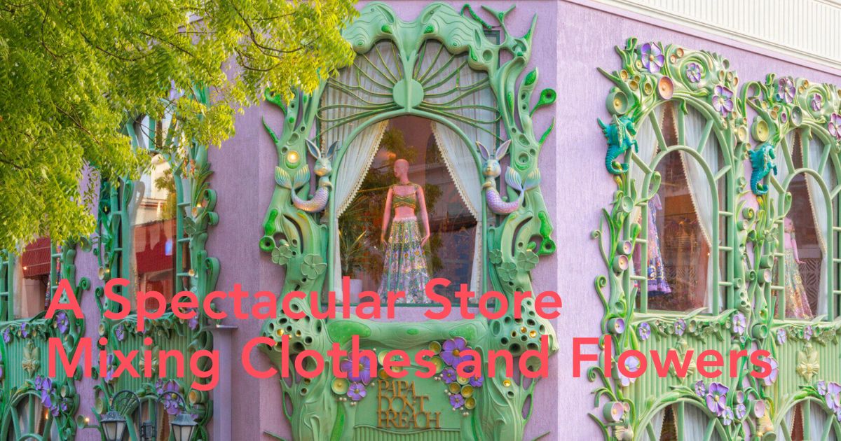
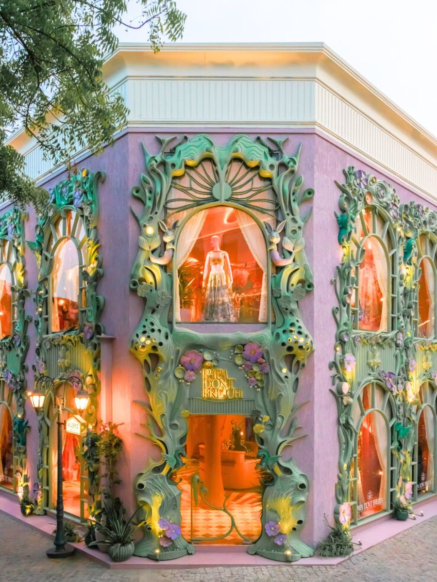
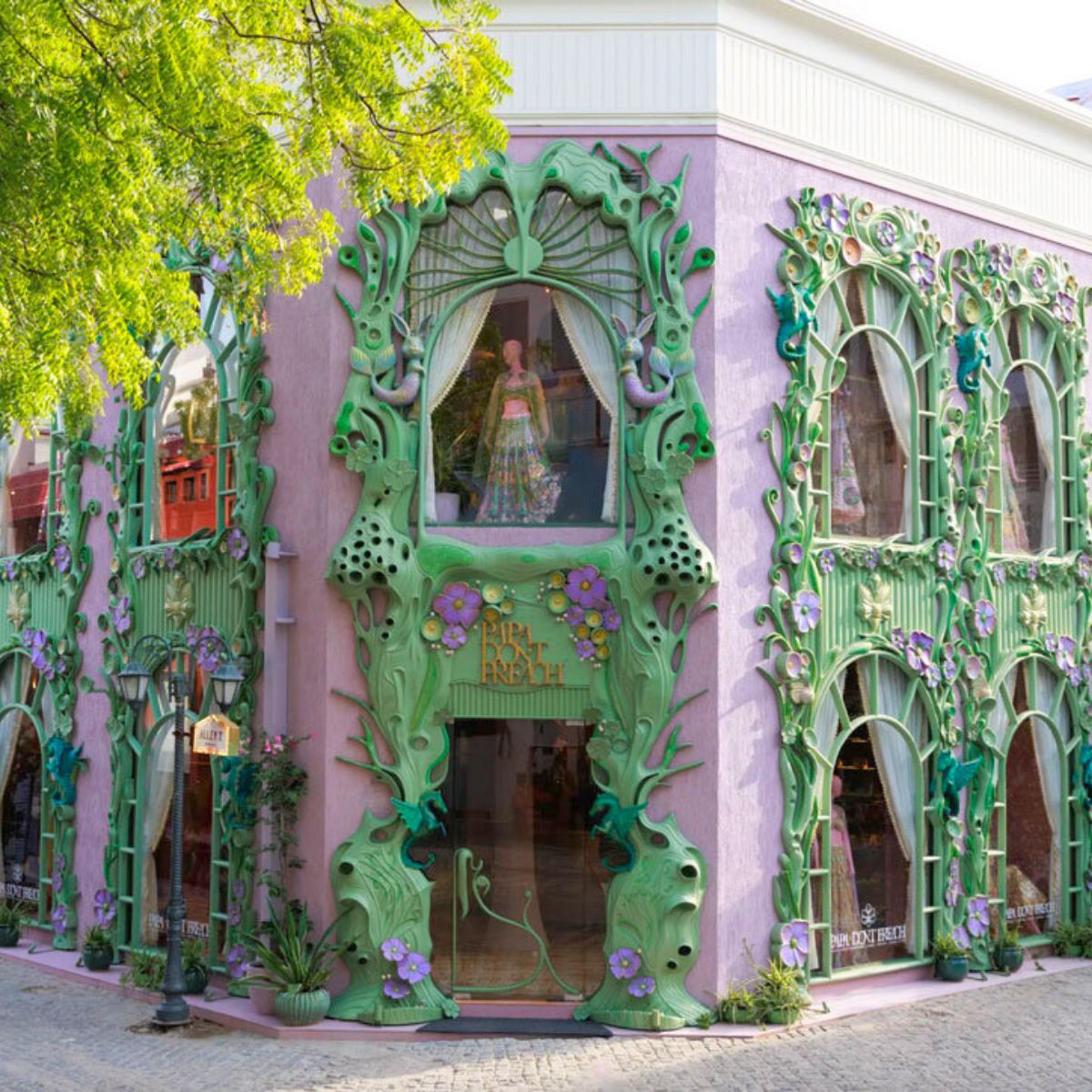
Shimona Bhansali of DesignHex created the new flagship store for apparel brand Papa Don’t Preach, situated in Delhi, India’s Dhan Mill complex. The exterior architectural design resembles something out of a fairytale, with flowers and plants climbing across its sculptural facade, creating an enchanting first impression before stepping inside. The project combines materiality, sculptural shape, and narrative-driven detailing to form a spatial expression of the brand’s visual identity.
Straight Out of a Fairytale, Blossomed Silhouettes Wrap ‘Papa Don’t Preach’ Delhi Store
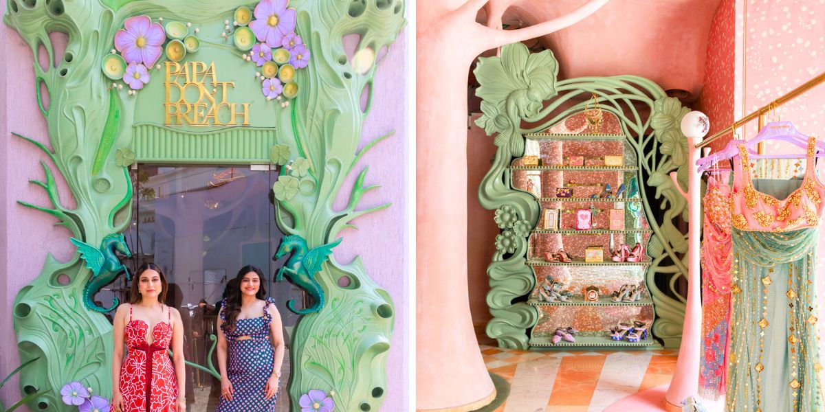
With two tonnes of hand-carved natural wood embedded with sculpted marine animals and organic plant forms, the store's exterior is inspired by folklore underwater scenes. A layered, textured surface is produced by combining high-relief panels with CNC-cut parts. Lavender and sage green pigments create a faint iridescence by reflecting sunlight. The facade, which was finished in sixty days, establishes the mood of the interior spatial sequence.

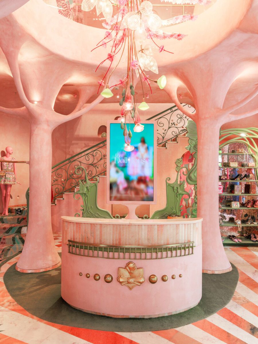
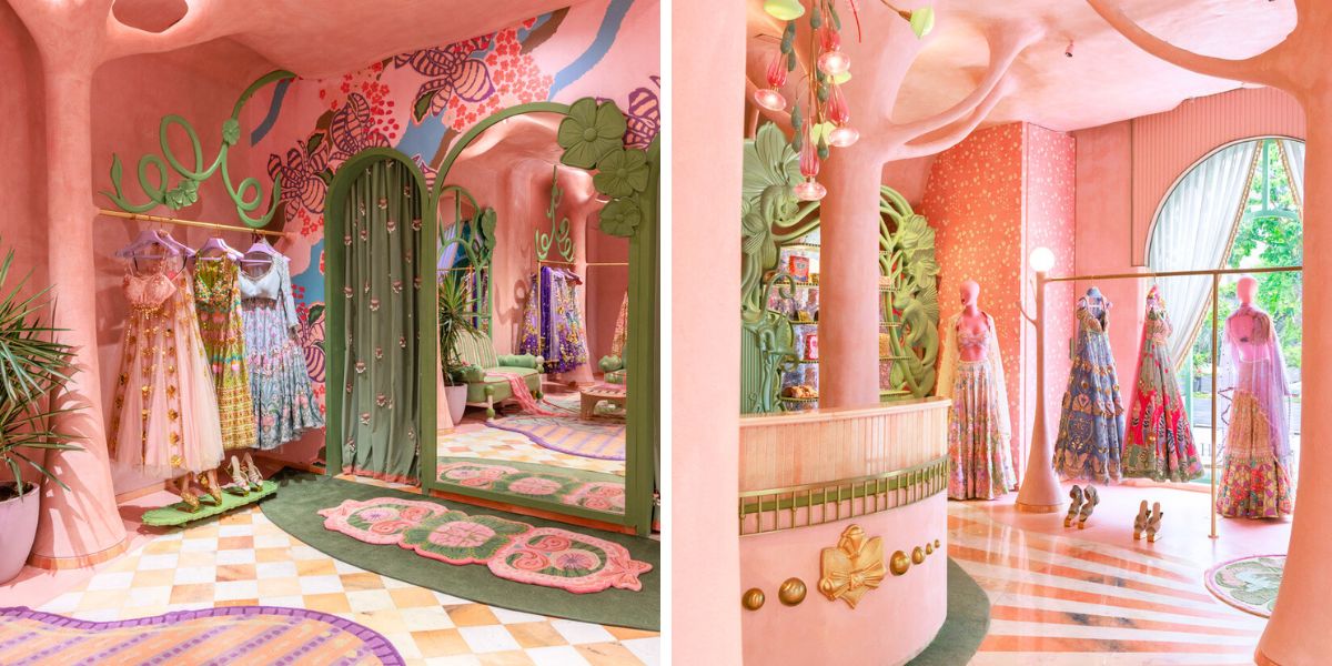
By using a palette of gentle pinks and blush tones on surface and structural components, the interior space preserves visual coherence with the brand's Mumbai store. In an act of natural support and artistic development, Studio DesignHex transforms the existing columns into tree-like shapes with branches reaching toward the ceiling. The textured pink paint applied to these sculpture elements adds material richness and visual coherence.
Organic Textured Details Define the Flagship Store
The flooring introduces variation through a patchwork of pink and white marble, punctuated by sections of smooth micro-concrete. This deliberate mix not only creates a tactile contrast underfoot but also maintains a cohesive color palette that aligns with the store’s dreamy aesthetic. The interplay between these materials adds depth and dimension to the space, guiding the eye across different textures without breaking the overall harmony.
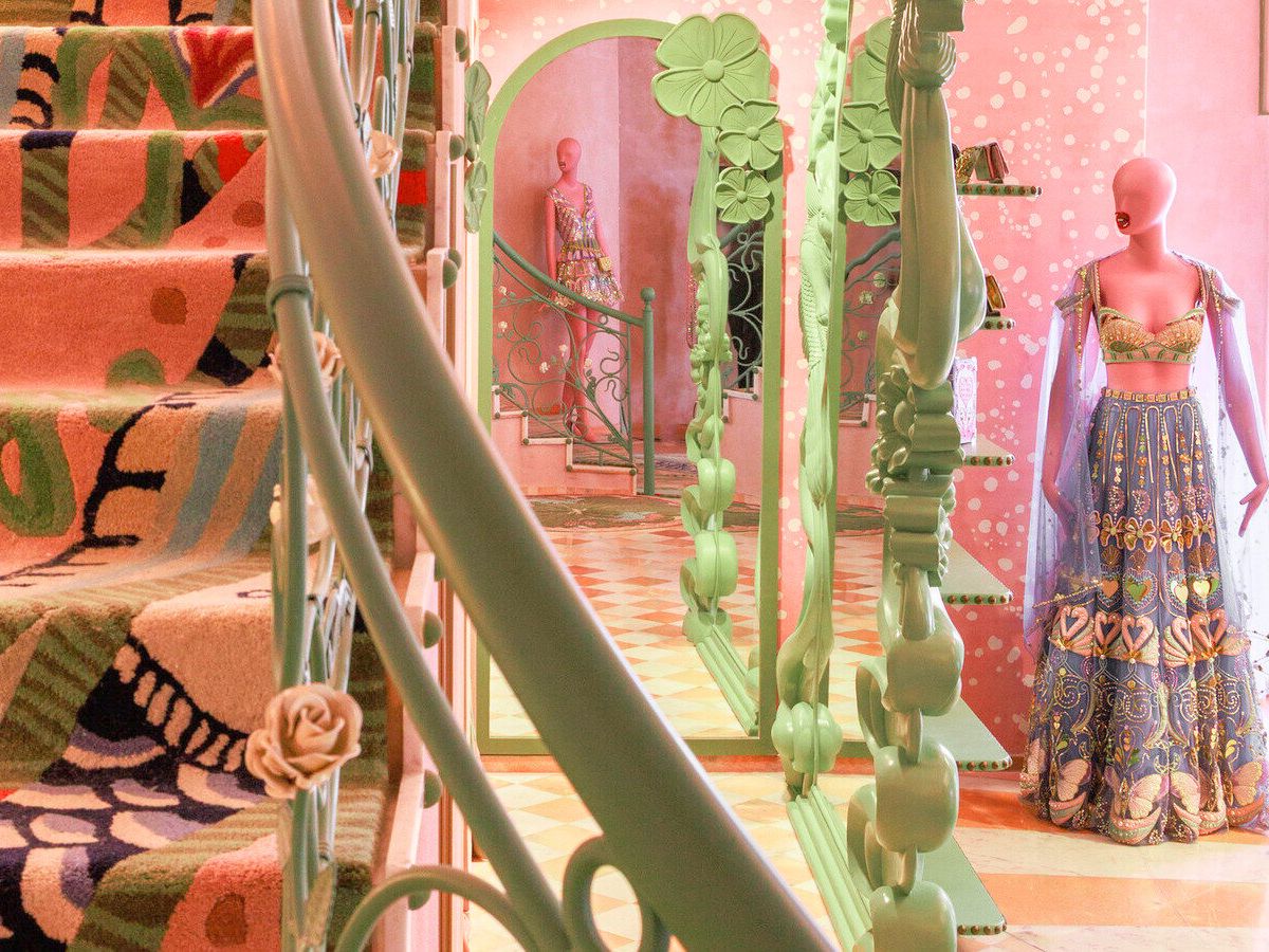
Expansive windows flood the interior with natural light, casting shifting patterns that evolve throughout the day, further animating the reflective and textured surfaces. As sunlight moves across the marble and micro-concrete, it highlights subtle details, giving the store a constantly changing atmosphere that feels both dynamic and inviting.
By combining product display with spatial narrative, the store's functional zoning facilitates a seamless shopping experience. The design is meant to support both movement and rest periods, which is consistent with the brand's narrative and performative approach to fashion.
The store's location within the Dhan Mill complex is consistent with the area's transformation from an industrial zone to a commercial and cultural center. By placing apparel in a sculptural setting that strikes a balance between ornamental details and spatial clarity, DesignHex's intervention frames the flagship as a retail destination as well as a tangible extension of Papa Don't Preach's design philosophy.
Lavender as the Chosen Flower Color
Born in 2010 in the pulsating city of Mumbai, the brand is true to its name, bringing to the world an unapologetic rebellion with a sense of humour and riotous play while playing with the delicacy of colors to bring forward their sense of fashion, connected with nature and the beauty of flowers.
In India, lavender doesn’t have as deep a traditional cultural meaning as native flowers, but it has gained symbolic and emotional associations in more recent years through aromatherapy, wellness, and modern floristry.
In the Indian context, lavender flowers are often linked to:
Calmness and positivity – especially in wellness spaces, Ayurveda-inspired spas, and home décor- lavender is seen as a mood-soother. In some spiritual or meditative settings, lavender is believed to help 'clear'energy and promote peace of mind. Because lavender is not native to most of India, it’s seen as exotic, refined, and often used in high-end events or weddings for a touch of elegance.
What do you think of this design, merging fashion with architecture and the art of florals?

