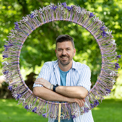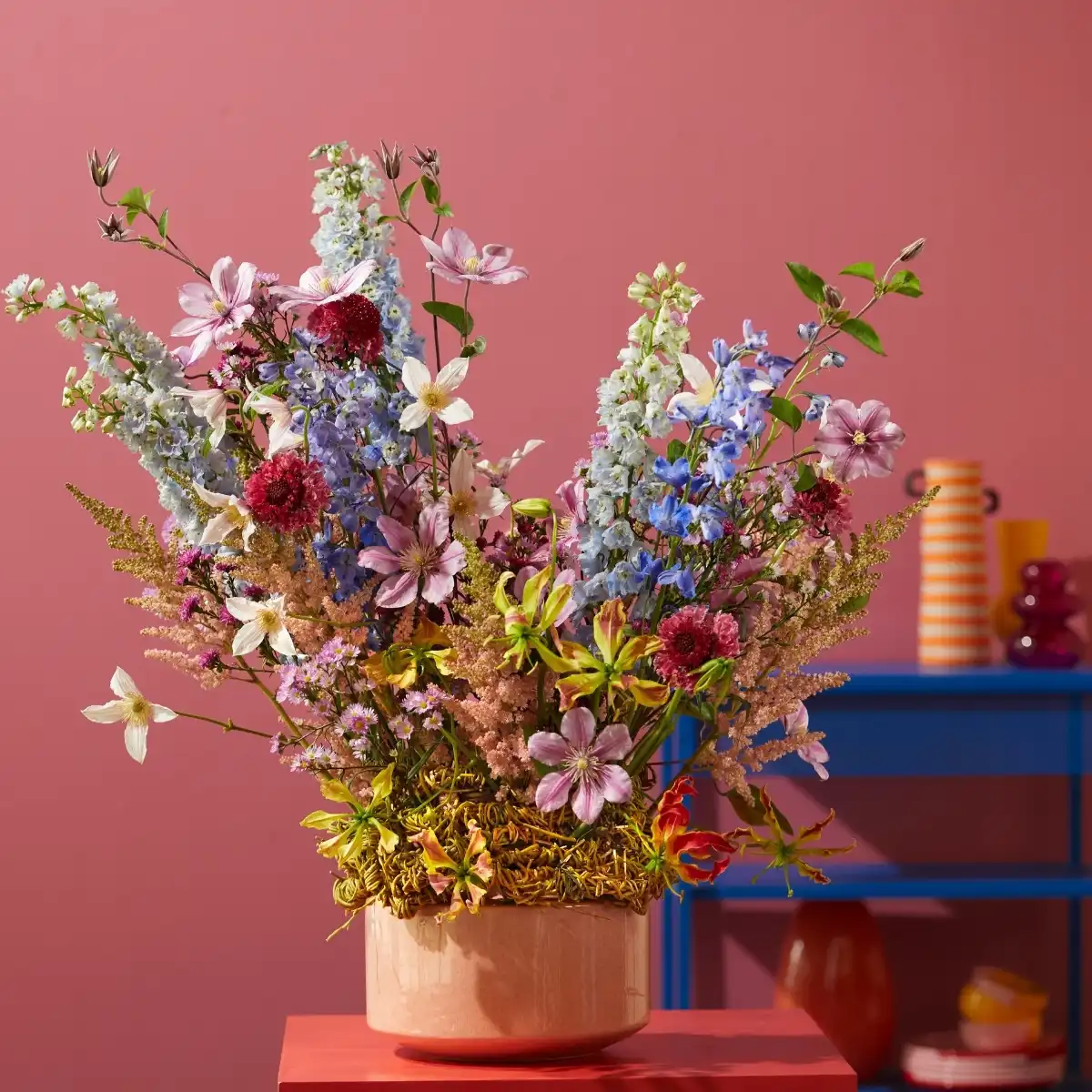
For the second year in a row, I was honored to create designs with the wonderful flowers from Marginpar as the basis. If you've seen last year's series that started with 'Paradise by the Water', you know how lucky I am. Also this year, every arrangement starts with a small idea—a color, a texture, a shape. Sometimes it’s the container that speaks first, sometimes a flower that’s in season and hard to ignore. Together, they are irresistible.
In the coming three weeks, I will show and talk about my three summer designs using flowers from Marginpar. Each one grew out of a different mood, but they all have something in common: they let the flowers breathe. Whether it’s a loose bouquet with a wildflower feel or a bold bowl of just two ingredients, I try to find that space between intention and improvisation. These designs were all made without rushing, photographed in natural light, and shaped by the textures around them—wood, yarn, glass, even skin.
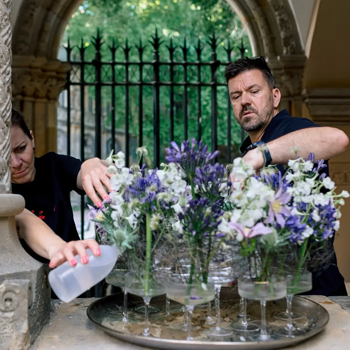
Here are the first two designs for this year.
Design #1: The Queen of Summer With a Playful Floral Headpiece
Let's start with a fun one. I wanted to explore what happens when flowers aren’t just held or placed, but actually worn—when the human form becomes part of the arrangement. The result was a small photo series with my model Pető Laura.


The shared tones were pink, salmon, green, and white. Fresh, cheerful, and very summery—but not over the top. I like it when colors stay friendly without shouting. For the headpiece, I used Clematis Amazing® Miami, mini Gerberas, Phalaenopsis orchids, and Lisianthus. I also added dried textures for contrast and longevity. Everything was fixed onto a wire base that could flex and adapt to the model’s head shape.
The form of the piece wasn’t random. I shaped it to highlight the model’s features—the curve of her jaw, the angle of her eyebrows. It was meant to enhance, not hide. That’s something I always aim for when designing wearable flowers: it has to feel like an extension of the person, not something sitting on top of them.

One detail I really enjoyed was the Gerbera petals under the eyes. We used body paint to fix them in place, and it created this direct connection between the floral element and her expression. Almost like makeup, but botanical.
If you’re trying this yourself, think of wearable flowers more like fashion than floristry. Shape, proportion, and wearability all matter. And don’t be afraid to use dried elements alongside fresh ones—they add structure and can carry weight without wilting under pressure.

Design #2: Color Contrast in a Garden Bowl
This design came from the contrast itself. I had two materials I wanted to work with—deep purple Clematis Amazing® Tokyo and bright yellow Craspedia Paintball™ Pop. Both strong in shape, bold in color, and just enough on their own. No fillers, no greenery. Just the clash and balance of two personalities.

I worked outdoors with this one, placing the flowers into a matte dark grey ceramic bowl using floral foam. The form was compact and low, keeping the visual energy centered and close to the surface. Because I wasn't blending in any soft textures, the lines needed to be precise. There’s nowhere to hide when you only have two elements.
First, I set the arrangement on an old rusty wooden barrel. The colors popped against the texture of the weathered wood. Then I moved it to a thin metal garden table with a patina finish. Both surfaces told a slightly different story, but each brought out something in the pot and the blooms—either the shine of the Craspedia or the velvet tone of the Clematis.


This composition doesn’t try to be romantic or soft. It’s bold and unapologetic. But there’s still balance. The roundness of the Craspedia plays off the looseness of the Clematis petals, and together they create a rhythm that’s more dynamic than it first appears.
If you’re making something similar, trust the flowers to speak on their own. You don’t always need foliage to soften things. Sometimes clarity is more powerful than complexity. Choose materials that contrast in color and shape, and then give them room to shine.
And as always, the container matters. The dark ceramic bowl grounded everything here—it didn’t compete for attention, but gave the flowers a strong base to lean into. It’s a small arrangement, but it carries weight.

Follow This Series
Next week I will present my two following summery designs. Be sure to check back on Thursd.com to see more of my creations.
Designs by Krisztián Kövér, Flowers by Marginpar, Decorum Plants & Flowers. Model: Pető Laura. Other contributors: Lehner Stylit, Dekorvilág Nyester kft, H & R The Wire Man, Botanica Dánszentmiklós, Botanica Resort.