.jpg)
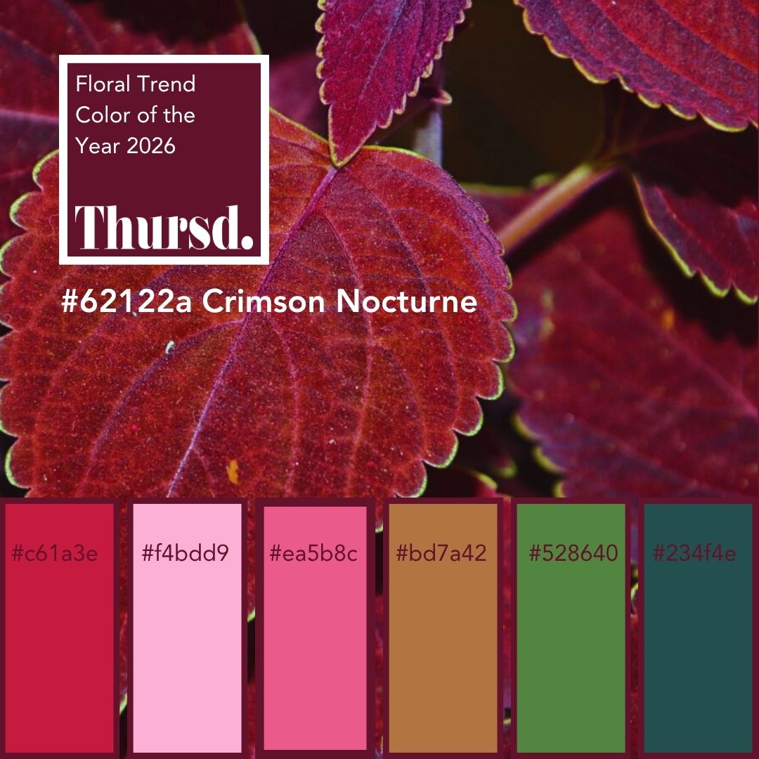
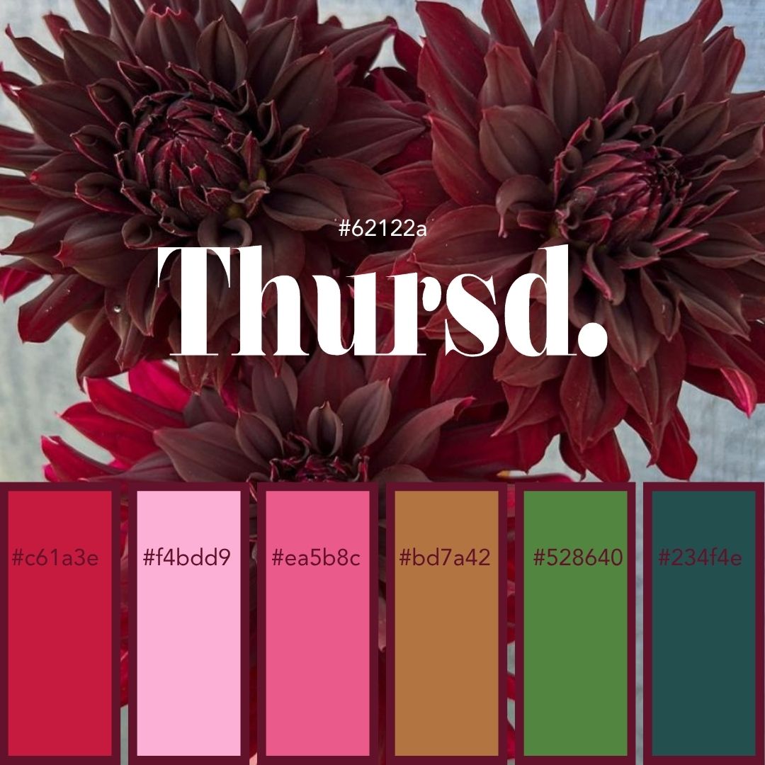
Thursd reveals the Floral Trend Color of the Year 2026: Crimson Nocturne – A Pulse Deep Within (#62122A). You could describe it as a deep, muted crimson with a touch of cocoa – elegant, grounded, and timeless.
There are moments in life, in flowers, when color goes beyond what we see and becomes something we feel. Crimson Nocturne is exactly that. It is not simply a color, a tint, a hue, it’s an atmosphere, a pulse even, of how flowers connect us to life’s deepest emotions.
For 2025, I chose Amethyst Glow as the Floral Color of the Year, with the broader Aurora Glow palette. It was a celebration of shades inspired by the skies, a color story about ethereal light, the soft glow of transformation, of possibilities, and the beauty of serenity. Lavender spoke of openness, healing, and connection. It was a year of calm radiance and subtle strength, of lights like aurora borealis, not always seen with our eyes, but it’s there, in all its glory and magnificence.
What's the Thursd Floral Trend Color 2026? Crimson Nocturne!
Now, the mood shifts. From the glowing skies of aurora borealis, I wanted to take us deeper, into the richness of night. Into a color that holds weight, maturity, and mystery. Instead of looking up at fleeting light, I wanted to anchor us in the profound stillness of darkness. A shade that does not just glow, it resonates… That is how Crimson Nocturne was born.


Why Crimson?
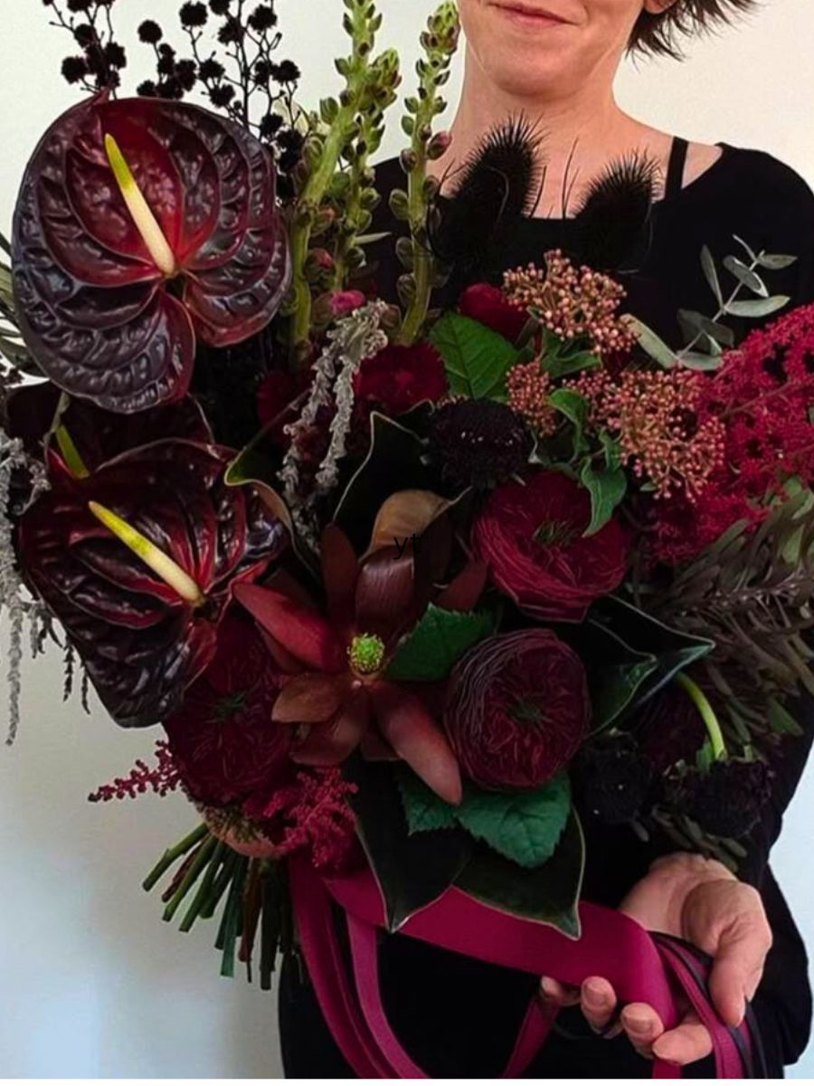
Crimson has always carried more than one meaning. It is passion, courage, and love, but also solemnity, reflection, and depth. In flowers, crimson shades hold the gaze differently than any pastel or bright tone. They don’t ask for attention; they command it. They stand strong and grounded. They are flowers that tell stories of devotion, of resilience, of timeless richness, a gem’s color. There are roses, Chrysanthemums, Dahlias, Carnations, Amaranthus, Cosmos, Scoops, callas, Clematis, Anthuriums, orchids, and many more…. Crimson has always carried duality. It is love, but with gravity. Passion, but with elegance. It is devotion, rather than infatuation, and courage, rather than impulse. In floristry, crimson flowers anchor a design. They give depth, character, and strength. This particular crimson, with its undertone of burgundy and eggplant, brings a sense of maturity. It is not the red of a first love, but the red of a lasting connection. It is the color of wine shared at a table with friends, the color of petals that hold their beauty long after bloom, the color that whispers rather than shouts. The anchor we need to ground warmly.
Why Nocturne?
The word nocturne comes from music. And I love music. Composers have always used it to describe pieces meant to be played in the evening, inspired by the stillness and emotion of night. A nocturne is not loud or showy; it is quiet, intimate, and deeply stirring. Flowers in Crimson Nocturne share that quality. They create atmosphere. They make you feel without needing explanation. They transform a space into something unforgettable, like music that lingers even after the last note fades.

The Bridge Between Amethyst Glow and Crimson Nocturne
Where Amethyst Glow was light, open, and ethereal, Crimson Nocturne is grounding, rich, and soulful. Together, they create a bridge: from the lavender skies of possibility to the crimson nights of presence. It feels like a natural progression. First, we looked at the world through lavender lenses, learning to appreciate softness and calm. Now, we are ready for depth. We are ready to sit with our emotions, to embrace boldness, to honour the side that is more mysterious and holds secrets of the future. Expecting, without knowing what the future will bring, but embracing it anyway! Amethyst Glow taught us to breathe. Crimson Nocturne teaches us to feel.


A Story in Flowers
Imagine a bridal bouquet in Crimson Nocturne. It is not the innocent bouquet of pastel blushes, but one that tells a story of intensity, of love that is both fiery and grounded. Place it in a contemporary wedding and it brings drama. Pair it with soft Pink and Greens, and it becomes a masterpiece of contrast. Combine it with golden caramel brown or passion red, and it sings of autumn’s richness. The Forest Teal is a bridge between nature green and ocean blue, which for me is a message of nature making this story as a whole.
Now picture Crimson Nocturne in event design. A gala where table arrangements glow under candlelight, the deep flowers reflecting shadows and light in equal measure. Or in daily life, a single vase of Crimson Nocturne blooms, changing a room, bringing with them a presence that feels alive, soulful, and grounding.
.png "Thursd Floral Trend Color and Palette 2026 Crimson Nocturne")
Sustainability and Meaning
For me, choosing a Floral Color of the Year is never just about aesthetics. It’s about meaning, connection, and responsibility. Crimson Nocturne reminds us of the role flowers play in slowing us down. In a world that moves too fast, this shade invites reflection. It encourages us to sit at the table a little longer, to notice the details, to value the presence of nature in our lives. It is also a color that speaks to sustainability. Rich, deep flowers often last longer in design, offering not just beauty but also longevity. Choosing Crimson Nocturne means choosing flowers that endure, that hold their story for days, sometimes even for weeks. In this way, the color is a metaphor for the future of floristry itself, beauty that lasts, choices that matter, stories that go deeper than the surface.


The Emotions It Holds
Every Floral Trend Color of the Year I choose must carry emotion. Crimson Nocturne holds many. Love that’s not fleeting, but rooted and, if possible, lasting. Strength in beauty that never goes out of style. Presence in flowers and in life. Secrets and mysteries, it’s good not to always know everything. And silence that says so much more than words. When I see this color in flowers, I don’t just see petals. I feel the light of night, the intimacy of music, the richness of history, and the bold happiness of the present. Be mindful, live in the moment, but don’t forget to walk your road, create your path for the future. It is a shade that encourages us to dream, but also to act. For Florists and Designers: To create designs that matter, stories that resonate, and connections that last.

Thursd Floral Trend Color 2026 Palette: Crimson Movement
The palette joining the Thursd Floral Trend Color 2026 carries the name Crimson Movement. When I look into the future years, I believe storytelling will become even more important. And education, knowledge, authenticity, and craftsmanship are necessary. What makes something unique, unlike anything else, what makes it Thursd? How can we create trend drops for every season and have our content partners involved in this process? How can we make them shine? Fashion-forward, I think the deeper, darker, and warmer colors will be the guideline for the world we live in. I created a content calendar for all of you to join the Thursd Movement. Create and share your stories with Thursd.


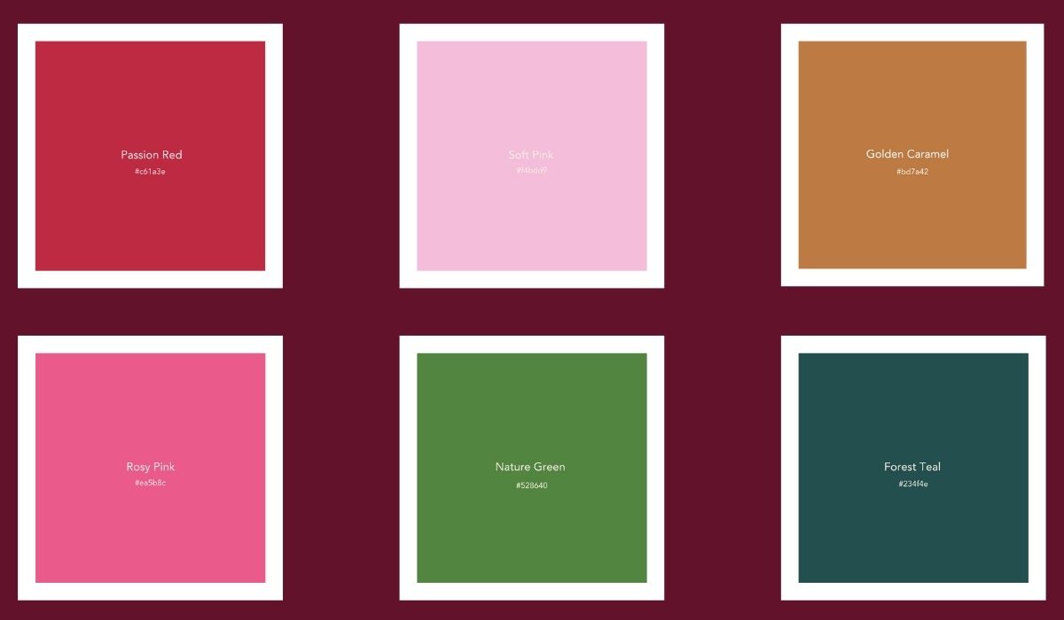
The Colors of the Thursd Floral Trend Color 2026 Palette – Crimson Movement
Crimson Movement, the palette joining the Thursd Floral Trend Color of the Year 2026, is all about community.
- Passion Red (#c61a3e): The heartbeat of the palette. Passion Red celebrates energy, creativity, and love for flowers. When paired with Crimson Nocturne, it becomes a dialogue between intensity and depth. Passion Red was the Trend Color 2023, but it's timeless and luxurious, the ideal color to connect to Crimson Nocturne.
- Soft Pink (#f4bdd9): Gentle and comforting, Soft Pink brings tenderness into the palette. It softens the power of Crimson Nocturne and adds romance and light.
- Rosy Pink (#ea5b8c): Young and confident, Rosy Pink bridges passion and playfulness. It adds a fresh, modern touch that brightens and balances the darker tones.
- Golden Caramel: (#bd7a42) Warm and grounded, Golden Caramel adds a hint of sunlight and earth. It connects the palette to nature and brings a feeling of comfort and timeless beauty.
- Nature Green (#528640): Symbol of life and renewal, Nature Green represents growth and balance. It pairs beautifully with the reds to create harmony between emotion and nature.
- Forest Teal (#234f4e): Mysterious and calming, Forest Teal is the quiet depth of the palette. It gives contrast and sophistication, echoing the stillness of nature after dusk.
.jpg "Thursd Floral Trend Color of the Year 2026 Palette Crimson Movement Attila Nemeth Pumpkin Design")
Looking Ahead – A Thursd Movement
With Crimson Nocturne, I hope to inspire breeders to not just create new colors, but to act on feelings that bring colors to life. To inspire growers and designers around the world to explore the deeper side of floristry. To step away from the predictable and go for the poetic, the deeper sense. To use flowers not just as decoration, but as language, a way to communicate the things we feel but cannot always say.
For 2026, let us bring Crimson Nocturne into weddings, events, homes, and public spaces. Let us see how it transforms everything it touches. Let us celebrate not only the brightness of flowers, but also their shadows, their depth, their music.
Because flowers, like music, are not just for the daylight hours. They are also for the night, when silence reigns and emotions deepen. And in those moments, Crimson Nocturne shines.

Use the hashtags #ThursdFloralTrendColor2026 #FloralTrendColor2026 #TrendColor #CrimsonNocturne.