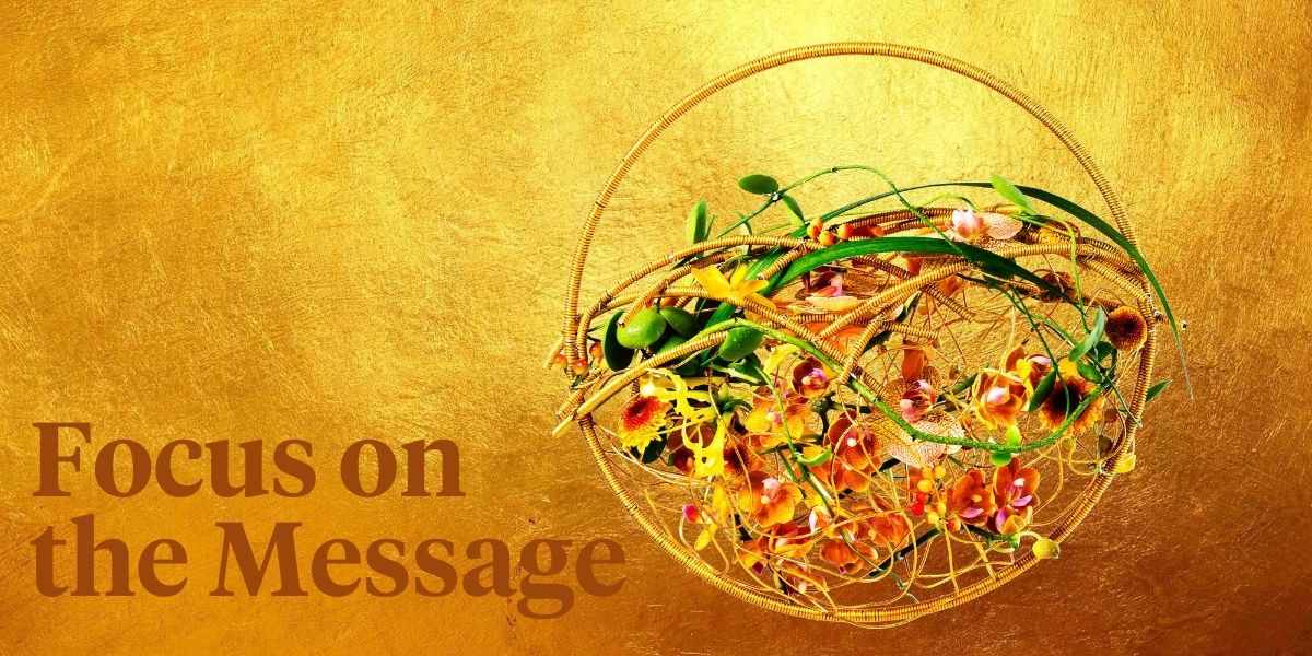
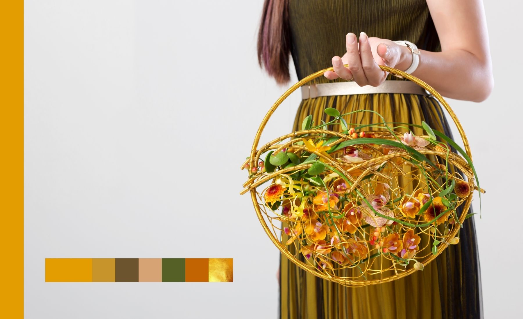
This is a bridal bouquet I designed in the spring of last year to showcase during a seminar hosted by
Cohim Flower School China, focusing on color trends for 2020-2021.
A Color Doesn't Exist on Its Own
Besides the golds and earthy tones, it is the dress that in fact completes the picture, as colors are actually impossible to detach from material, texture, and form. They literally do not exist on their own. It is the connection between the light source, the object, our eyes, and our mind that makes, in essence, each color an experience in itself.
We, as floral designers, should aim for the same outcome: to deliver an experience through our floral work that both answers the universal need to connect and creates a unique emotion. And often people lose that perspective of the ensemble, as they focus too much only on one element, in some cases one particular color.
Trends Evolve, Colors Communicate
The color of the year is decided in a conscious way, with an unconscious feeling. A trendy color, in actuality, reflects a culture’s emotion. The color with the strongest story can become the trendy color, yet it is the combination of colors that make the story complete, by creating context.
There is no real control over how trends appear, as they are deeply connected to our behavior as humans. Just as meteorologists do not make up the weather, but they read the signs that tell us ahead if it will rain or not, the trendspotters are able to identify the signs given by trendsetters and pick them up. From here on, the trend followers make the magic happen, and a trend becomes a fashion, a behavioral pattern widely showcased.
The universal meanings of colors are born within our own individual ability to not just see color but to feel it. Color is an experience in itself and it is rooted in behavioral experiences, cultural influences, while the personal, unique perception offers color an infinitely different dimension. Anyone who wants to make a strong, original statement should find a way to stand out. Coming up with ‘trendy’ colors in an avant-garde fashion, before people consciously take them in is a challenge. A trendy designer first and foremost learns from the past and present developments and human behavior as it is that retrospect view that brings you automatically a future trendy color.
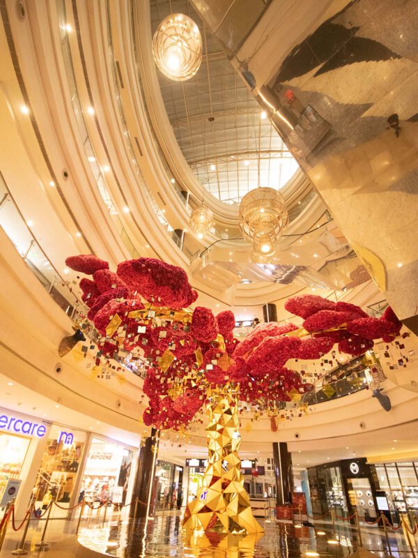
Golden and yellow colors, symbolically, are deeply anchored in the ideas of wealth, value, light, celebration, and its millennial use. Connecting these meanings to nature preservation and sustainability is a concurrence of the people’s interest in this and it translates into adding value to things that truly matter. There is a more and more eco-friendly conscience building in people’s minds and it becomes a behavioral pattern.
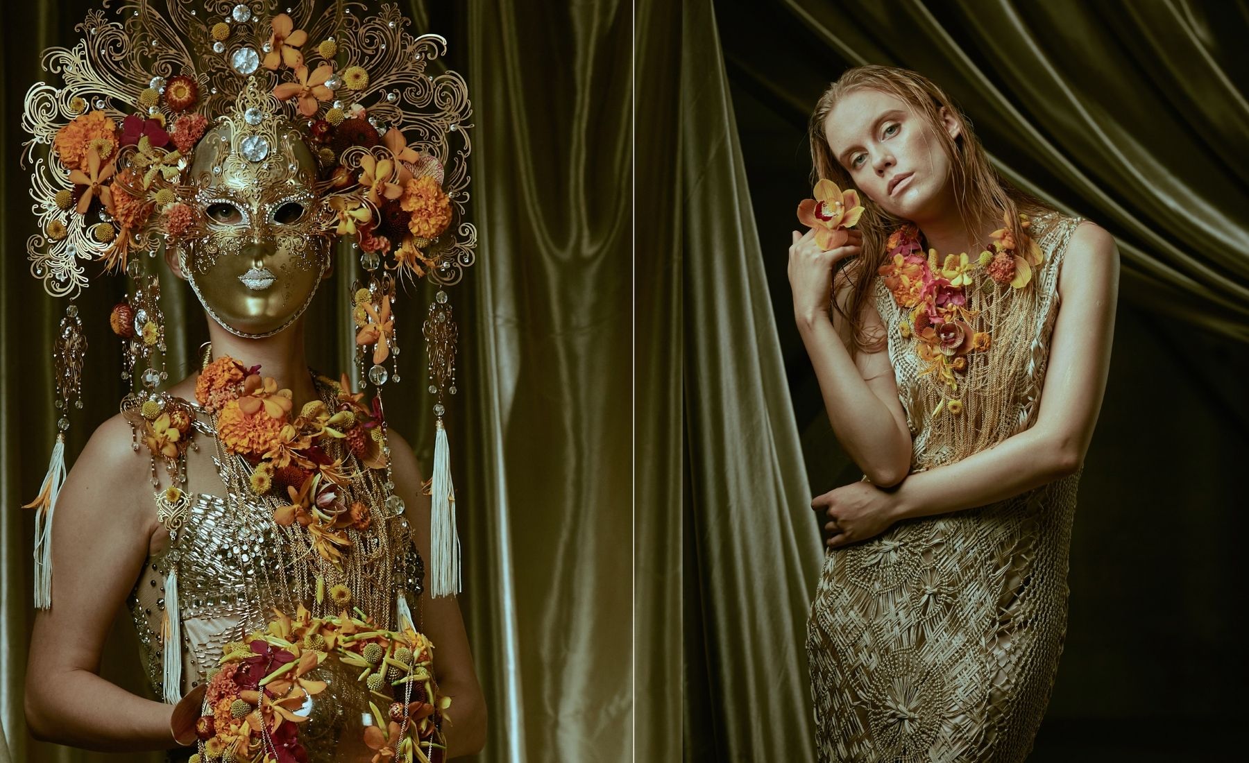
The exact nature of color perception beyond the physical aspects, and the status of color as a feature of the perceived world or rather as a feature of our perception of the world — a type of qualia — is a matter of complex and continuing philosophical dispute. Color trends are focusing more on the concept of experiencing colors, rather than seeing colors.
One Color - Infinite Possibilities
The play and combination of the color range in conjunction with the synopsis of a trend makes the story, which in the end has to come together in a design concept. All elements have to interact in a harmonious way and it even gives the highest
Gestalt possible — that’s the challenge and what a concept is about.
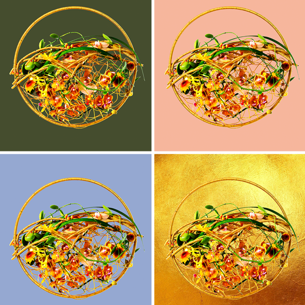
When a color of the year is launched, the focus of designers should not be on the color itself, but rather on the possibilities it presents. This mustard yellow color has one effect on people when used with pastels, and a different one when used with light blue. The focus here is on the message one wants to deliver. As floral designers, we have full control over the use of color, over the interaction it has with other colors and elements of the design. Doing huge events myself; what I mostly choose are the colors and the synopsis. These describe the direction of the mood, as they have the biggest visual impact and are the direct communicators of the installation.
Knowing your medium in order to reflect a trendy color is key. A floral designer should know more about the flowers but the mere care and handling, they should especially how the medium can translate creative ideas, color, form, and texture-wise. Growers nowadays provide such a wide range of possibilities are have proven to be very trend-aware in their product developments. The appearance of a trend such as "Scorched Yellow" meets a market that seems already prepared to face it. We have such rich varieties of colored flowers in yellow, mustard, earthly tones, and seeing that developing for the market a particular flower takes years, this comes to prove the growers were sensing a change in color preferences in the industry.
Innovative Solutions
In the past, I have reached out to
Gebroeders BAC to buy their stunning mustard, almost golden-colored cymbidiums. Nowadays companies like
Alexandra Farms offer the '
Golden Mustard' rose and the
'Caramel Antike' garden rose’ as beautiful varieties of naturally grown roses. Also,
VIP Roses and
Montana Lisianthus have come up with innovative solutions to produce tinted flowers. All these and more show that growers are really up to date and color trend aware.
How Do Colors Interact and Work
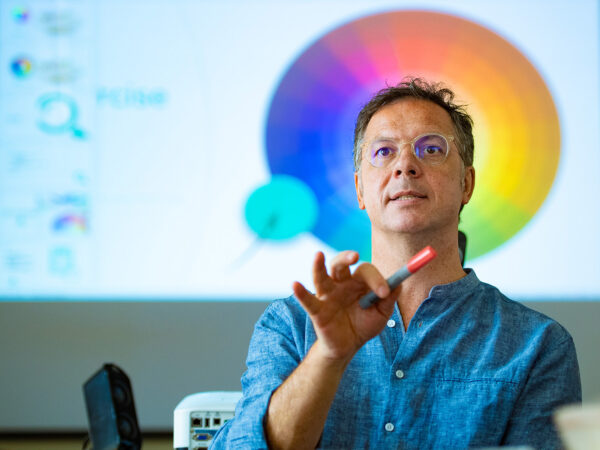
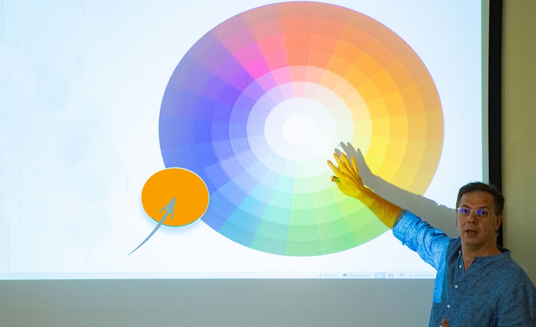
Each flower is a chromatic composition in itself. For floral designers, it is rather the knowledge of how colors interact and work in relation to the entire composition that is key. What is the impact of the color? What is your intention as a designer for using color? What effect does it have on the viewers? And how will you, as a floral designer, develop your ability to output your vision? These are questions that I always encourage my students to ask themselves when it comes to the chromatic input in their work. At
EMC, where I teach, I put great value on learning from Art, as floral design as a metier is, ultimately, an artistic profession. We play with the same elements and principles as an artist, like balance, texture, proportion, and color. The difference is our pigments, our control over generating a color is limited to how nature or growers provide them.
Color Ramifications
Sustainability is such a complex topic in itself, it needs more than one singular approach. Hence, playing with different color palettes surrounding "Scorched Yellow" as the main theme is an approach that we should for sure see in floral designs.
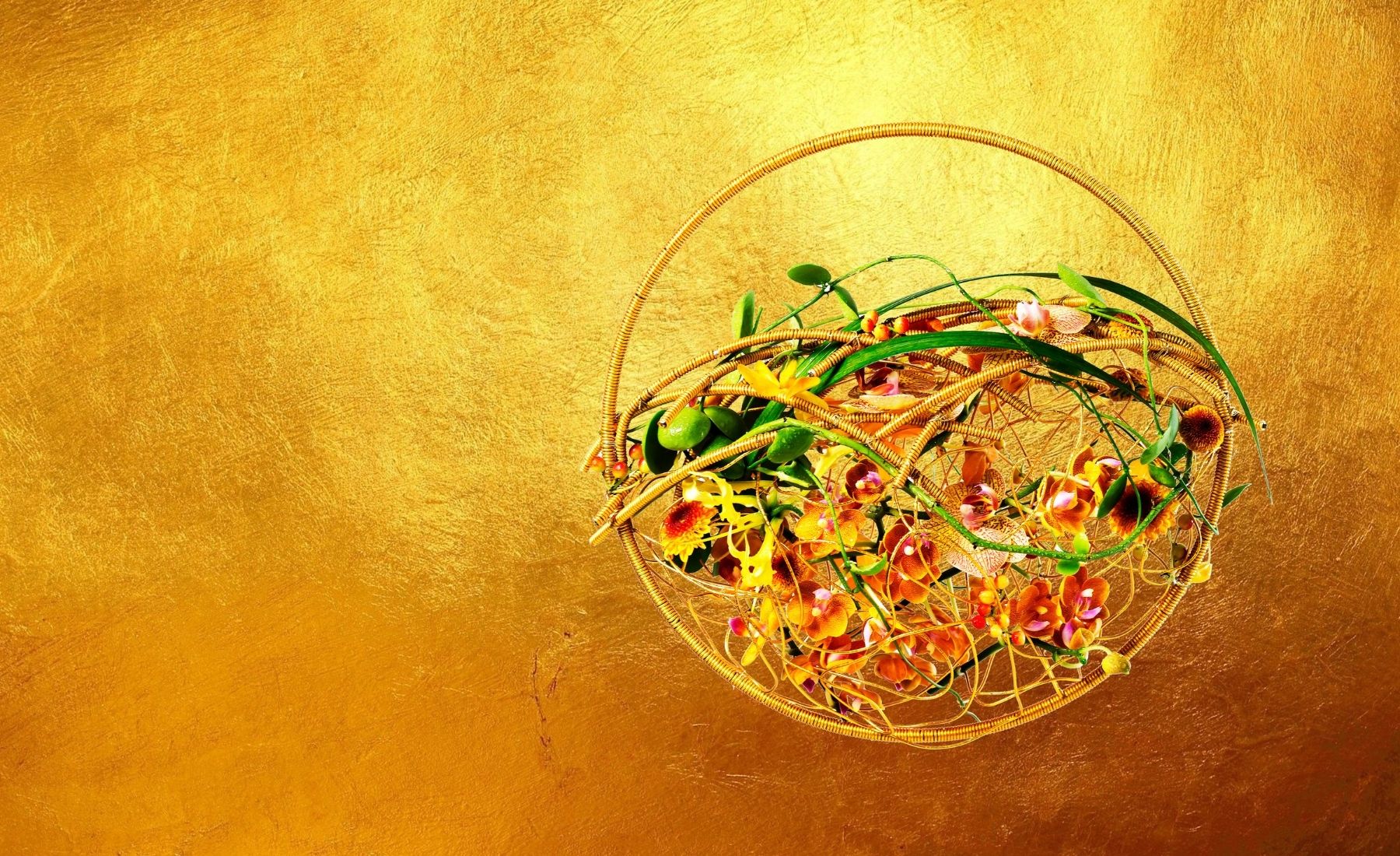
This particular design was inspired by the very idea of sustainability, starting from one element. A hand made, 100% natural bee was candle needed an eco-friendly approach. The entire design is not only respective of nature through its elements, all bio-degradable mechanics, but through the message colors convey.
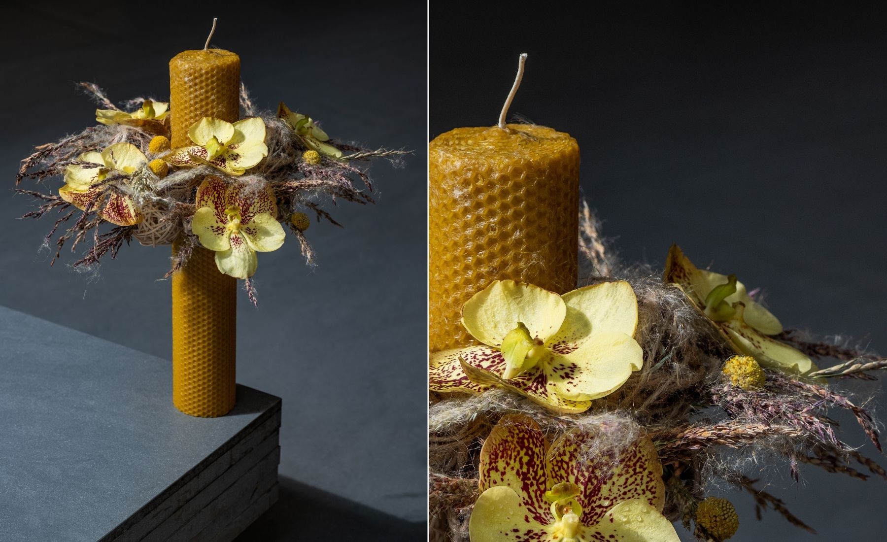
A "one trend color fits all" is almost a utopia. It’s an illusion and a guide at the same time. Each trend is generally translated into at least four different trends (having the common trend color as the main color) and expressing different moods, such as for example avant-garde, classic, pure, b Trends play with different visual color outcomes focusing on the visual strength of a particular outcome connected to a typology.
There are infinite possibilities in playing with one single color. The creative infinite potential, though, lies all in us, and the goal is always to detach yourself from the ordinary to become extraordinary!
 Photos by COHIM (China), Alex Mateiu (Romania), Tanuj Bhatia (India)

 We, as floral designers, should aim for the same outcome: to deliver an experience through our floral work that both answers the universal need to connect and creates a unique emotion. And often people lose that perspective of the ensemble, as they focus too much only on one element, in some cases one particular color.
 The universal meanings of colors are born within our own individual ability to not just see color but to feel it. Color is an experience in itself and it is rooted in behavioral experiences, cultural influences, while the personal, unique perception offers color an infinitely different dimension. Anyone who wants to make a strong, original statement should find a way to stand out. Coming up with ‘trendy’ colors in an avant-garde fashion, before people consciously take them in is a challenge. A trendy designer first and foremost learns from the past and present developments and human behavior as it is that retrospect view that brings you automatically a future trendy color.
 Golden and yellow colors, symbolically, are deeply anchored in the ideas of wealth, value, light, celebration, and its millennial use. Connecting these meanings to nature preservation and sustainability is a concurrence of the people’s interest in this and it translates into adding value to things that truly matter. There is a more and more eco-friendly conscience building in people’s minds and it becomes a behavioral pattern.
 The exact nature of color perception beyond the physical aspects, and the status of color as a feature of the perceived world or rather as a feature of our perception of the world — a type of qualia — is a matter of complex and continuing philosophical dispute. Color trends are focusing more on the concept of experiencing colors, rather than seeing colors.
 Knowing your medium in order to reflect a trendy color is key. A floral designer should know more about the flowers but the mere care and handling, they should especially how the medium can translate creative ideas, color, form, and texture-wise. Growers nowadays provide such a wide range of possibilities are have proven to be very trend-aware in their product developments. The appearance of a trend such as "Scorched Yellow" meets a market that seems already prepared to face it. We have such rich varieties of colored flowers in yellow, mustard, earthly tones, and seeing that developing for the market a particular flower takes years, this comes to prove the growers were sensing a change in color preferences in the industry.

 A "one trend color fits all" is almost a utopia. It’s an illusion and a guide at the same time. Each trend is generally translated into at least four different trends (having the common trend color as the main color) and expressing different moods, such as for example avant-garde, classic, pure, b Trends play with different visual color outcomes focusing on the visual strength of a particular outcome connected to a typology.
There are infinite possibilities in playing with one single color. The creative infinite potential, though, lies all in us, and the goal is always to detach yourself from the ordinary to become extraordinary!
 Photos by COHIM (China), Alex Mateiu (Romania), Tanuj Bhatia (India)

