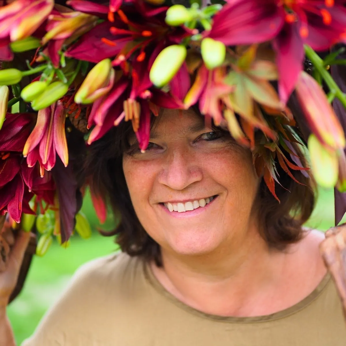
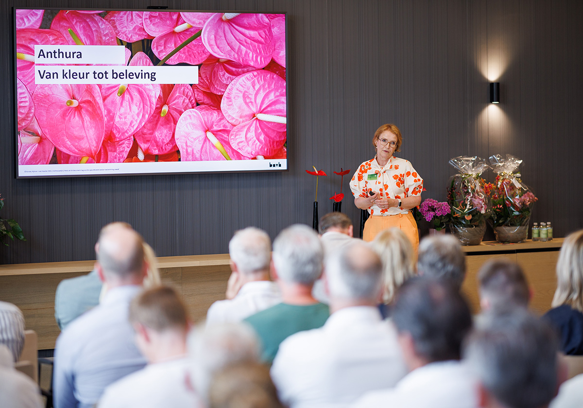
Hi, my name is Aafje Nijman. I am a trend watcher and storyteller with a focus on interiors, flowers, and plants for the international market. And I am a co-founder of Bureau Nijman + van Haaster. Our core business is developing and adapting brand and product strategies. Colors play a big role in trends, also in floriculture. Let me introduce you to the basics of color and our perception of this phenomenon.
The Surprise of Color
Color is everywhere. It colors our world quite literally, but it also makes that world more interesting, more layered, and sometimes more surprising.
We can be surprised by a single bright pole in the street. By a flower that suddenly catches our eye. By white light breaking through water droplets and turning into a rainbow. Color changes how we look, how we feel, and how we respond to the things around us.
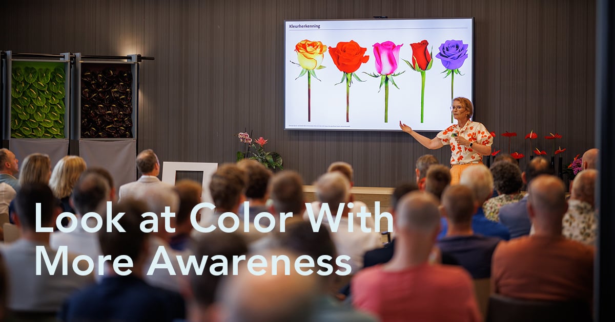
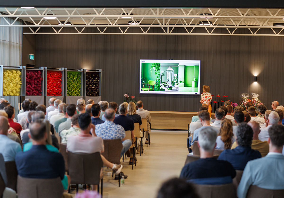
At Anthura NXT'26, I had the chance to dive into exactly that in front of a room filled with people from the floral industry. Not only to explain what color is from a biological point of view, but also what color does to us as humans. How we see it, how we experience it, and how we can use it in a smarter way with flowers and plants.
We Don’t All See Color in the Same Way
As humans, we only see a small part of the full color spectrum. Other living creatures see other things. Insects, fish, reptiles, and humans all experience color differently. But even within our own human world, there are big differences.
One of the most interesting differences is how men and women, in general, perceive color and visual information.
Of course, this is not about saying all women like one thing and all men like another. That would be too simple. But there are broad patterns. Men often respond more strongly to clear contrast, sharp lines, and a more direct visual message. Women often respond more to nuance, detail, variation, and a richer spread of visual information.
That makes sense when you look at how we developed. Historically, men were more focused on movement, contrast, and direction. Women were more focused on detail, had a wider field of vision, and were more attuned to subtle differences in color and shape. That difference still influences how products, interiors, advertising, and flowers are experienced today.
Color Blindness Matters More Than We Sometimes Think
There is another physical difference that is very relevant for our industry: color blindness.
Color blindness is much more common in men than in women. Roughly one in twelve men has some form of color blindness, compared with about one in 250 women. That means there is a real chance that someone making decisions about color, branding, packaging, retail presentation, or product selection does not see the same color differences as the consumer who buys the product.
That is something to take seriously.
For a color-blind person, a peanut butter sandwich and an avocado sandwich can look surprisingly similar. A calendar marked with pink and green blocks can become unreadable. But a flower presentation full of subtle red and green differences can lose part of its meaning.
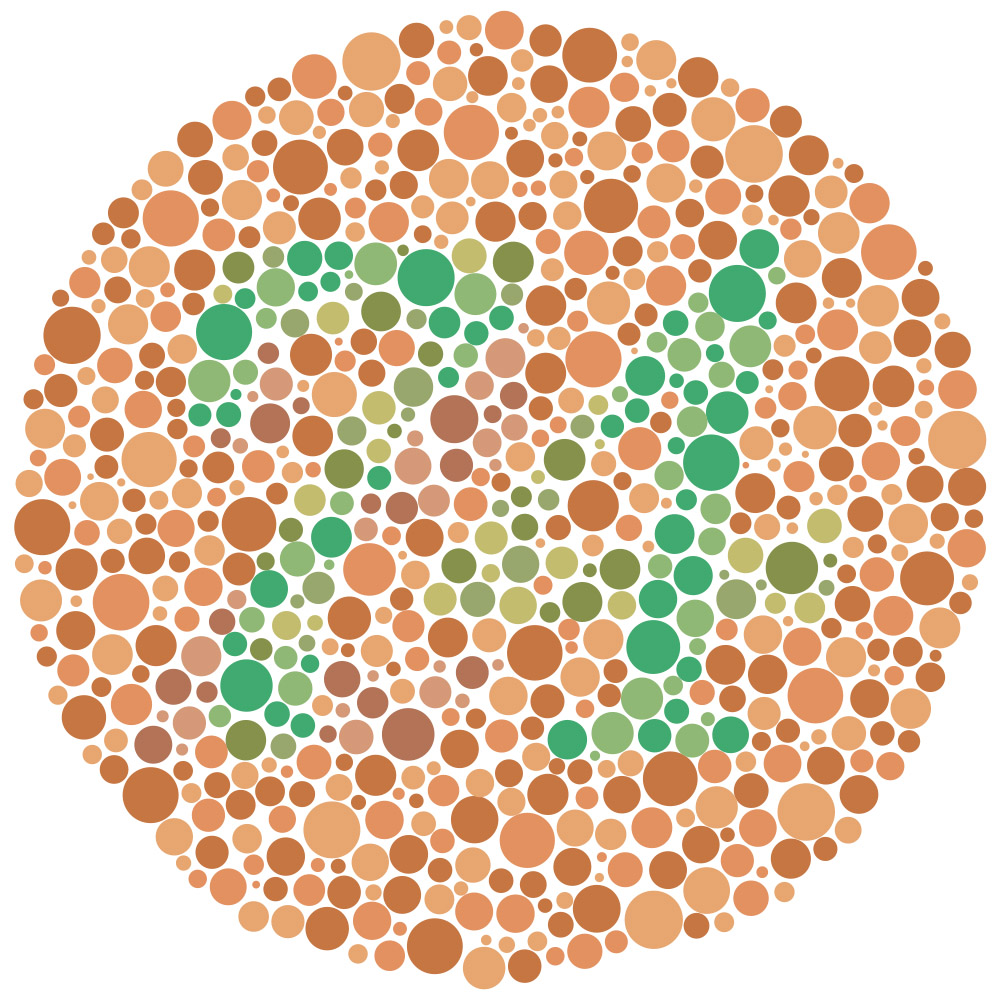
Viewers with normal color vision should clearly see the number 74.
Viewers with red-green color-blindness will likely see the number 21.
This is not only about flowers. You see the same thing in medicine, where pills are designed with both color and light-dark contrast so people can tell them apart safely. You see it in logos. You see it in sports, where red shirts on a green football field can become difficult to follow for people with red-green color blindness.
In flowers and plants, it means we should not rely on color alone. Contrast, shape, structure, lightness, darkness, and context all matter.
Color Needs Context
A color never stands alone. It is always influenced by its surroundings.
A yellow flower can look stronger when it is placed against a dark background. Put that same yellow in a lighter or slightly greenish environment, and it can suddenly feel less clean or less powerful. The flower has not changed, but our perception has.
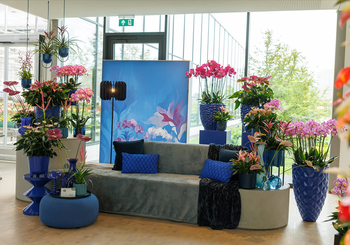
The same happens with dark red. A deep red Anthurium can appear stronger when placed next to a lighter, more contrasting color. When it sits in a more harmonious red-on-red setting, it can feel softer and less intense.
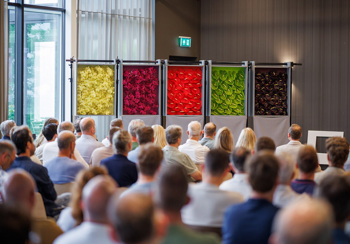
This is important for growers, breeders, florists, retailers, and everyone who presents flowers. The background, the shelf, the pot, the packaging, the light, and the neighboring colors all influence the way a flower is seen.
Sometimes the product is already strong, but the setting weakens it. Sometimes a smart setting gives the product more presence without changing the product itself.
Complementary Colors Make Each Other Stronger
One of the strongest principles in color theory is the effect of complementary colors. These are colors that sit opposite each other in the color circle. Red and green are the classic examples. Purple and yellow are another.
When red and green are placed side by side, the red appears redder, and the green appears greener. They push each other forward. The contrast makes both colors stronger.
That is one reason why red Anthuriums can be so powerful as pot plants. The red flower is always seen together with the green leaf. That combination is not accidental in the way we experience it. It gives the red more strength.
You see the same effect in everyday life. Butchers use green herbs and decoration because they make meat look redder and fresher. Florists can use the same principle with flowers and foliage, but in a more refined and creative way.
Warm Colors Come Forward, Cool Colors Step Back
Color also influences how we experience space.
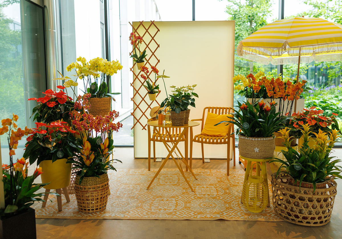
Warm colors such as red, orange, and yellow tend to come toward us. They feel closer, more active, and more present. Cool colors such as blue, purple, and green tend to move back. They feel calmer, fresher, and more distant.
In retail, this can be used very practically. A flower wall can feel deeper or longer when warm colors are placed toward the front and cooler colors toward the back. Reverse that, and the wall can feel flatter because the warm colors at the back visually come forward.
That is what makes color such a useful tool. It is not only about beauty or taste. It can shape how people move through a space, where they look first, and how they experience a product wall, a stand, a shop, or an event presentation.
Color Carries Meaning
Colors also carry symbolic meaning. We, humans, have given those meanings to them through culture, habits, history, and repeated use.
- Orange can stand for energy, warmth, fire, sun, and celebration. In the Netherlands, we also immediately connect it to the royal family. A darker orange can feel richer and more grounded, while a lighter orange can become softer and more refined.
- Red can mean love and warmth, but also danger, aggression, and energy. It can be powerful, romantic, sweet, or intense, depending on the shade and the context.
- Purple often moves between elegance, creativity, spirituality, dreams, and luxury. It is also a color people tend to either love or dislike. In fashion and interiors, purple can be very trend-sensitive. Sometimes it is everywhere, sometimes it almost disappears.
- Blue feels accessible, cool, rational, and calm. In flowers, true blue is still special. Often, what we call blue in flowers moves toward purple. That is why a genuinely blue flower, such as Gentiana, feels so distinct.
- Green is linked to life, trust, nature, calm, and safety. It can also carry darker associations, depending on the tone. In interiors and retail, green has become an important color because it brings a feeling of rest and connection.
- Yellow can move from golden and rich to fresh and light. It can feel sunny and direct, but also delicate, depending on the shade. Think of Mimosa in Italy on International Women’s Day. That yellow has become part of a cultural moment.
- Brown might not be the first color people think of in flowers, but it can be exciting when it works. It can feel earthy, chocolate-like, primitive, safe, and connected to Mother Earth. It can also feel dirty if the tone is wrong. That makes brown a delicate but interesting color for floral products.
- White is perhaps the most contradictory of all. It can stand for purity, light, marriage, mourning, softness, silence, and formality. In some cultures, white is strongly linked to grief. In others, it is linked to weddings. That double meaning makes white very powerful, but also very dependent on context.
Flowers Let Us Feel Color Directly
The nice thing about flowers and plants is that they do not explain color. They let us feel it.
You can talk about warm and cool colors, but standing in front of red and yellow flowers tells the story immediately. You can explain complementary contrast, but a red Anthurium with green leaves shows it in one second. You can describe the differences among purple, blue, green, brown, and white, but the product itself provides the emotional answer.
That is why I always find flowers such a strong medium for color. They bring theory into the real world. They show how color behaves in light, in space, with texture, with leaves, with packaging, and with people around it.
For florists, growers, breeders, and retailers, the opportunity lies there. Color is not only a product characteristic. It is a tool for storytelling, positioning, emotion, and sales.
Use Color With More Awareness
My main message is simple: look at color with more awareness.
Look at who is making the color decision. Look at who is buying the product. Look at the background. Look at the light. Look at the contrast. Look at the cultural meaning. Look at whether a color comes forward or steps back. Look at whether the combination makes a flower stronger or weaker.
Sometimes a small change in presentation can completely change how a product is experienced.
And that is the beauty of working with flowers and plants. Color is already there. The question is how we use it.
When we understand color better, we can create better assortments, stronger displays, clearer branding, and more meaningful floral experiences. Not by making everything louder, but by making color work harder.
Want to know more about colors and trends? Reach out to me via Bureau-NVH.