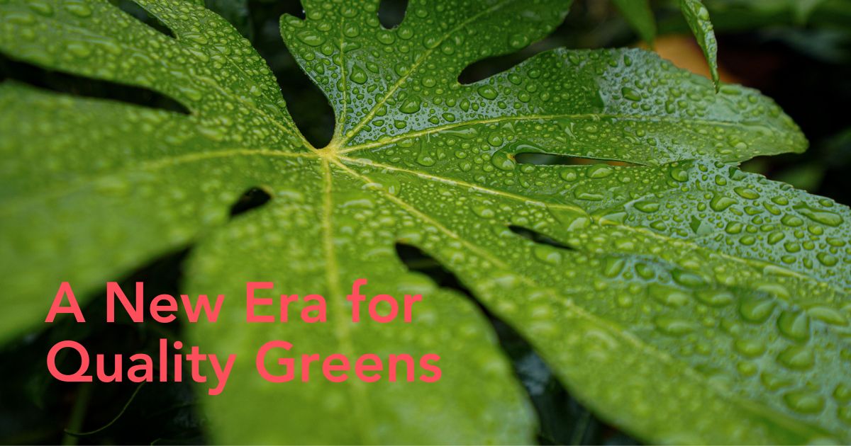
After nearly four decades of steady growth and consistency, TAK has entered a new stage in its journey – one that honors its origins while presenting a refreshed vision for the future of foliage. The rebrand is more than just being one of the coolest and most modern green visual updates; it is a clear statement about continuity, responsibility, and long-term purpose for one of the world's leading foliage companies. Learn more about the why and how behind the freshened-up rebranding.
TAK – A Brand Grounded in Years of Experience
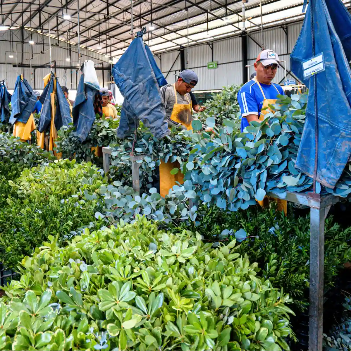
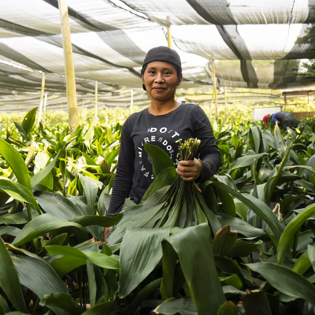
How to describe TAK? Rooted in the land. Powered by people. Growing with purpose. For 37 years, the company has built its reputation as one of the world’s foremost foliage producers. Behind every stem lies a story of consistency — a company that has remained committed to doing things well, from cultivation to postharvest. This foundation is what gives TAK its strength. The new brand image reflects that: grounded, modern, and straightforward, built on the same values that have guided the company since the beginning.
A new season for foliage
Today, the Guatemalan company stands as one of the world’s most important foliage grower, spanning multiple farms and operations across three different countries, a reflection of their remarkable development through the years. But what is behind the decision to rebrand the logo, mission, vision, etc? Keep reading to know more.
A Purpose That Extends Beyond Production
TAK's rebranding centers on its purpose – to enhance the world with premier foliage while honoring both the land and the people who cultivate it. The refreshed identity communicates this commitment through clarity and simplicity, aligning every aspect – from tone to design – with the company’s genuine respect for nature, collaboration, and long-term sustainability.

This new visual identity aims to reflect coherence in every area and aspect of the company. Each design choice was made to convey reliability, transparency, and focus. The outcome is a brand that feels confident yet unassuming – a reflection of a company that leads through action and social responsibility.

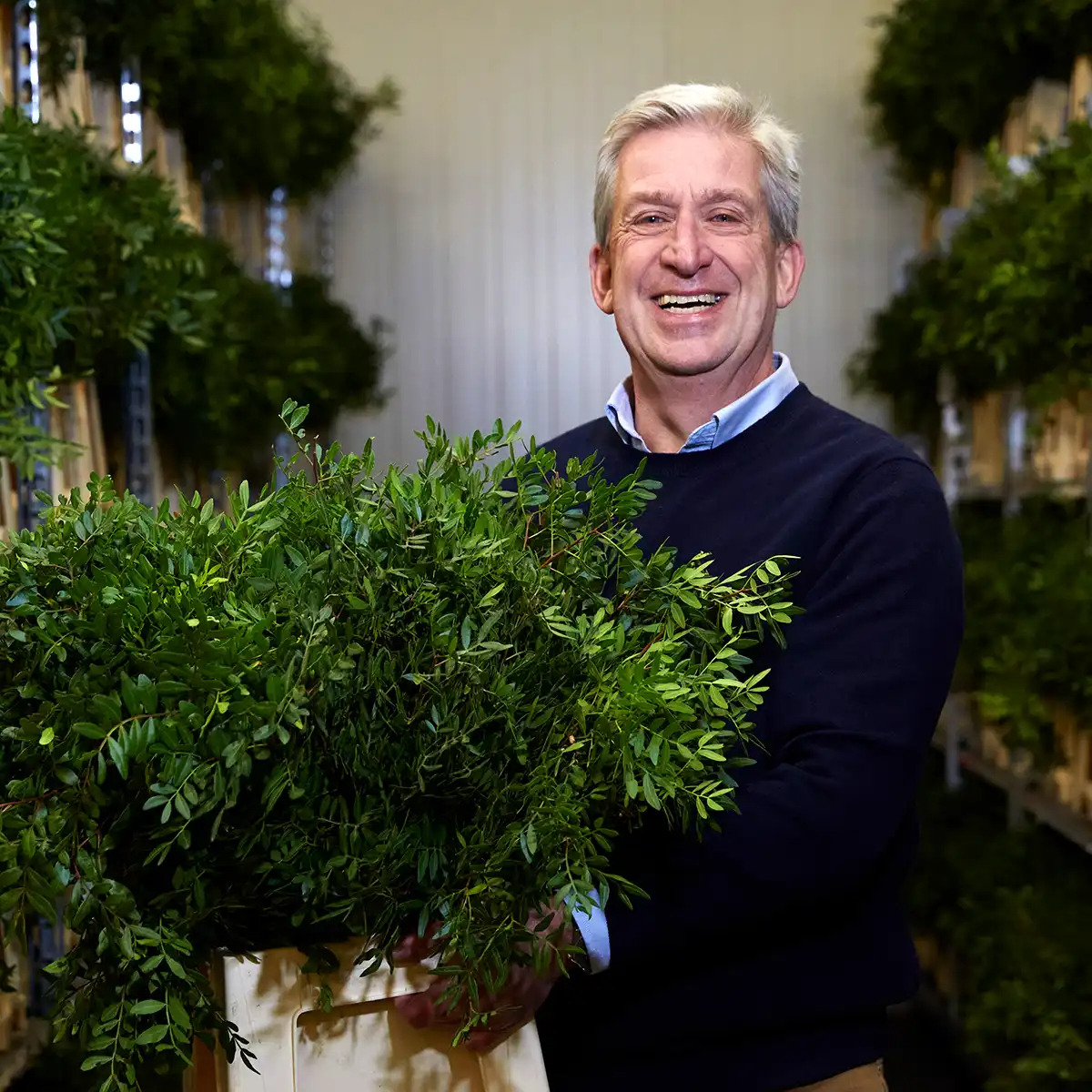
As a global leader in green foliage, with the capability to produce over 1,000 containers annually, the fresh logo and website symbolize the dedication to nurturing employee growth, fostering innovation, and upholding the highest quality standards. This commitment positions them as the ultimate partner for the ornamental industry.
This new chapter also reinforces their fundamental belief that growth comes from people and responsibility. The team's dedication is evident not only in the quality of each leaf but also in their shared commitment to ethical and environmental operations. From honorable cultivation to streamlined operations, the new visual identity exemplifies the idea that progress and environmental conservation go hand in hand.

They say:
"Every step in our greens production chain is held to the highest industry standards, ensuring your product arrives in perfect condition. We believe our success is only real when our clients succeed with us."

The Re-Branding Seen at Proflora 2025
On October 3rd, TAK proudly participated in Proflora 2025 – The Best Flower Trade Show and won third place in the varieties competition. They showed the new brand, diversity, quality, and beauty of Guatemalan foliage, sharing with the world what defines them: quality and purpose.
TAK's newest branding was present at Proflora 2025
There is a clear focus: to remain an aspirational and innovative leader in the global foliage sector, entering new markets while upholding the integrity that defines it.
Photos courtesy of TAK.