There's this idea that fall has to be a wash of orange, yellow, and brown—a classic that works, yes, but what if we could soften it? Imagine autumn reinterpreted with colors not so steeped in the warm tones. I think, and perhaps you'd agree, that a touch of white, light grey, and even some pastels can bring out the season's gentler side. With a cooler color palette, we’re inviting a fresh breath into displays for the fall season, where subtlety replaces the usual bold statements.
In a series of three blogs, I will show you seven of my autumnal designs—based on the lovely collection of Marginpar—and explain all about the flowers and techniques. Below, you'll find my first two pieces.
Design #1: The Greyish Pumpkin Pot
For the first design, I’ve come up with a massive copper pot from Nyester Kft, a Hungarian wholesaler. It's one of those statement containers that give an arrangement a bit of grounding while offering just the right reflective warmth. I started this one with floral foam as the base to give the stems that perfect structure.


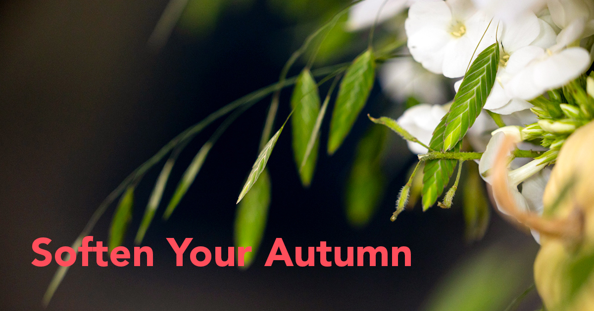
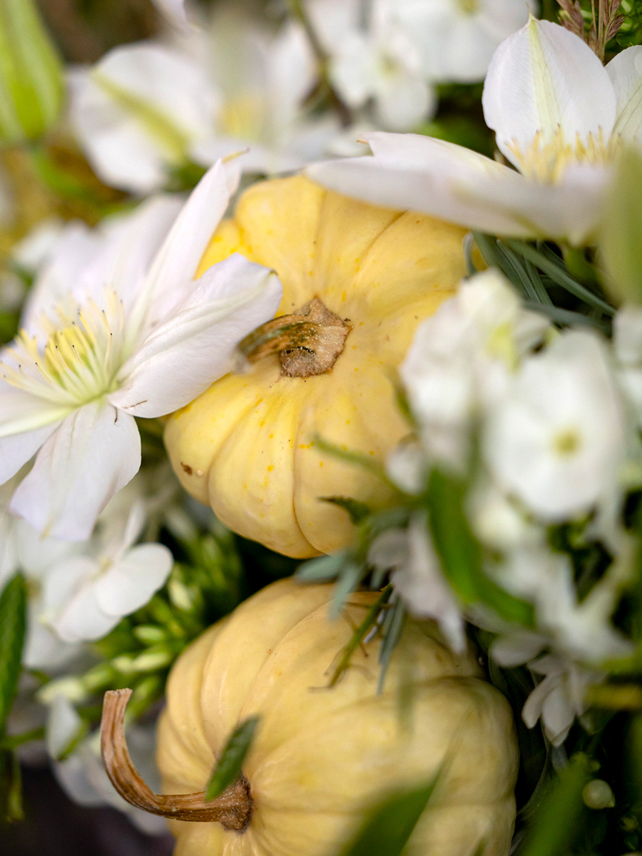
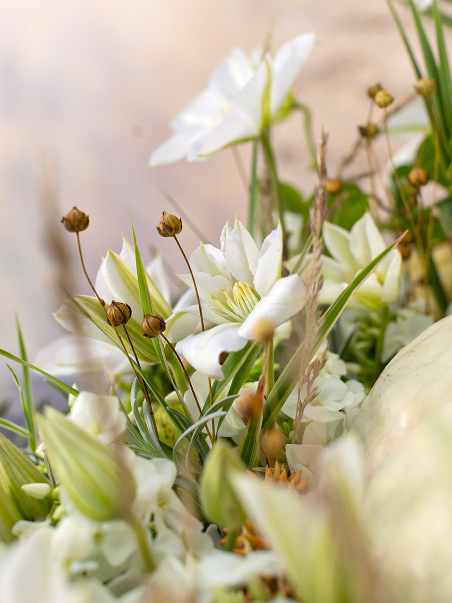
In the center of the pot, I’ve placed a large greyish pumpkin. Why the grey pumpkin? It's a quieter take on the seasonal squash, letting the flowers be the focus while still nodding to autumn’s harvest. Around it, we’ve layered flowers like Phlox and Clematis, known for their delicate yet defined forms, with Chasmanthium also from Marginpar adding a wispy, almost reed-like texture. To give it a bit more depth and a subtle, dried quality, we added dried blooms from Magyar Szárazvirág. The mix of fresh and dried keeps the colors just shy of overly bright, maintaining that soft, moody effect.
As a finishing step, we used Finishing Touch floral spray to lock in the freshness and help those flowers stay beautiful a little longer.
Flowers used in this design: Clematis Amazing® Vienna, Phlox Icecap, and Chasmanthium Mantis.

Design #2: Warm & Cool Autumn Wreath
The second arrangement for today is all about that balance between warmth and coolness, blending the traditional autumn feel with a softer palette. For the base, we started with a classical floral foam wreath, soaked thoroughly to ensure even moisture. This wreath holds the flowers securely but also allows us to layer colors without crowding. To keep the flowers lasting longer, each stem was cut back carefully with a knife—a little trick that allows for a clean, even drink of water.

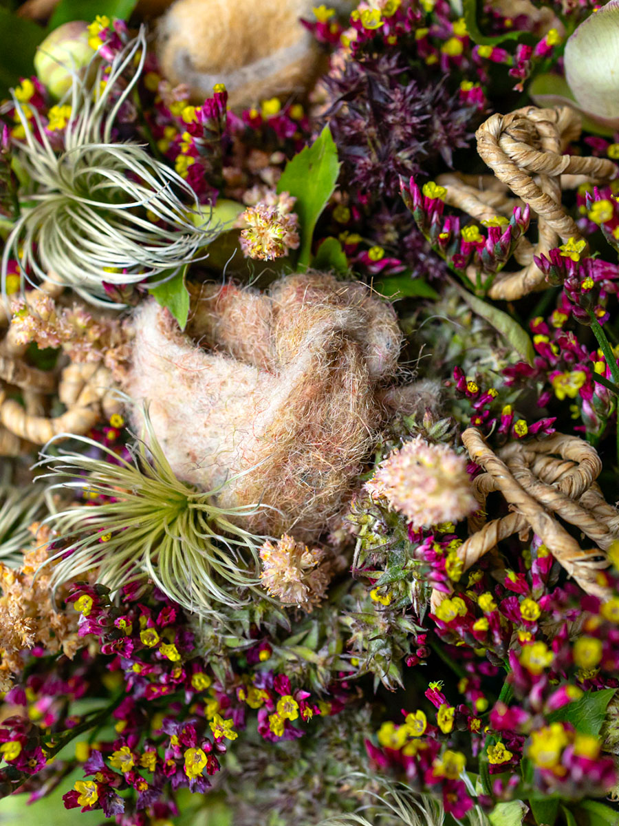
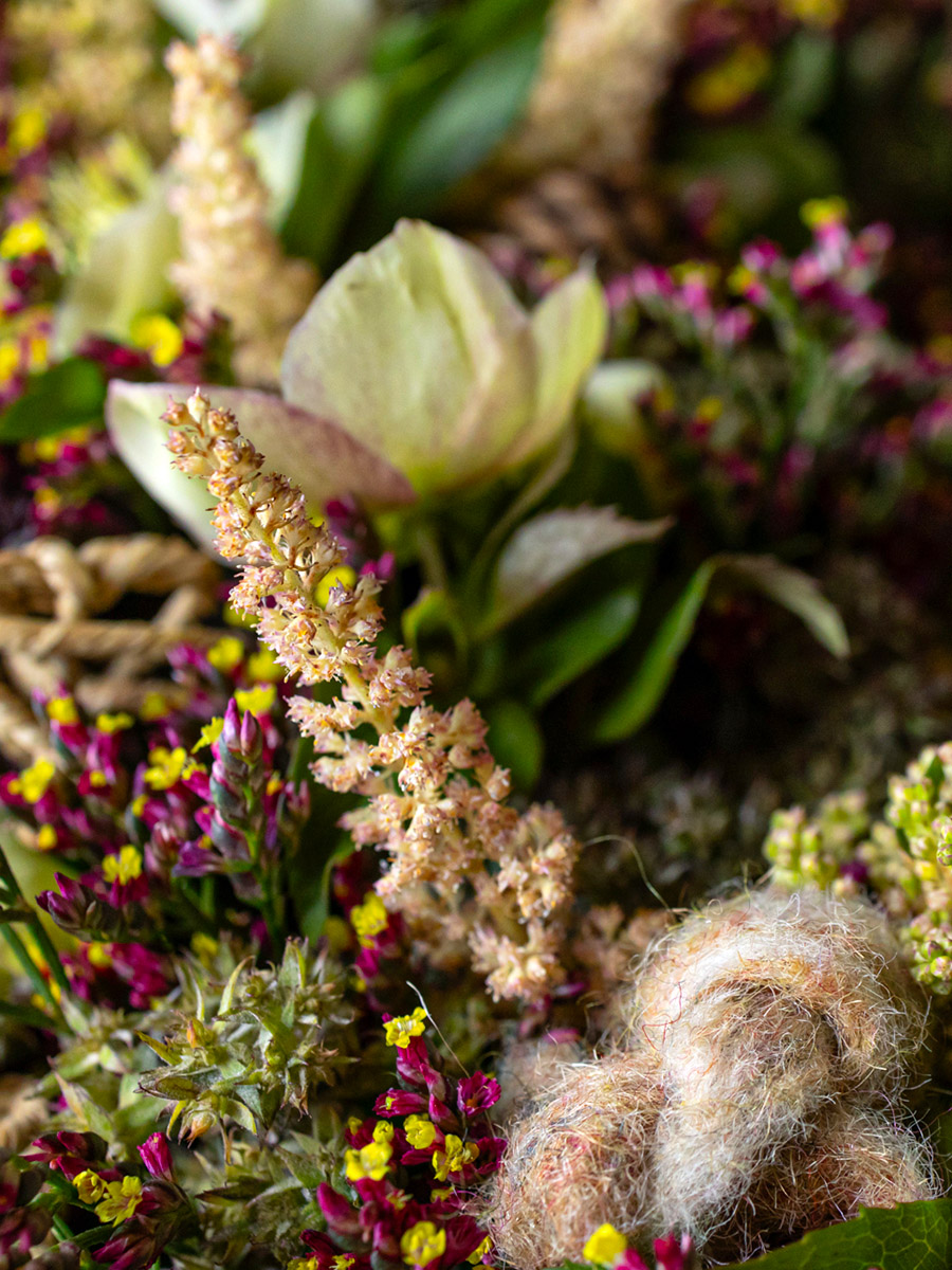
Here, the combination of Astilbe and Helleborus brings in a soft, almost feathery texture that’s both cozy and relaxed. The Clematis adds that slight whimsical touch with its starry shape, while Limonium introduces a gentle texture that helps the softer colors pop without shouting. We also incorporated some unique natural touches, like the delicate cones from Magyar Szárazvirág, tying in that earthy, woodland feeling. And adding in some small pieces of wool ribbons from Lehner-Wool provided a soft, tactile element that gives the arrangement a feeling of warmth—perfect for this cooler autumn take.
Flowers used in this design: Clematis Amazing® Kibo, Astilbe Vision Inferno, Limonium Scarlet Diamond, and Helleborus Mammoth White.

The Art of Subtle Color Blending
Part of what makes these two arrangements work is the careful color blending. When working with a muted palette like this, there’s a lot more room to play with subtle contrasts and textures. Think of it like painting with watercolors: each shade blends into the next, allowing for soft edges and natural transitions.
In the first design, the whites, greys, and pastels aren’t there to grab attention, but to create a background where each flower gets to shine in its own subtle way. There’s a layer of restraint in this type of arrangement that’s different from the usual bold autumn displays. It’s an exercise in layering cool tones with warmer textures and finding that balance where everything feels both calm and intentional.
For the second arrangement, I added wires from H & R The Wire Man’s collection to secure everything just so. It’s a small detail but one that makes a difference in keeping each flower where it belongs. Using wires also lets you play a bit more with the angles of each stem, creating a layered, three-dimensional effect that brings the arrangement to life.
Continue to my 2nd blog called Fall Colors From Yellow to Purple.
Overall credits: flowers by Marginpar, decoration and materials by Lehner Stylit, H & R The Wire Man, and Magyar Szárazvirág, designs by Krisztián Kövér.

